Akredito
22 November, 2019

About the project
The Akredito project was a web application created to solve a particular financial problem in Brazil. The company was just starting its activity and my team (me, as designer, plus a programmer) were responsible for bringing to life the first iteration of their idea. What this meant in practice: we aimed for a quick development of a usable product to put it to a test in the real world without taking too much time or investment in an idea that still needed more validation.
It was established by previous research that the majority of users would access the platform via mobile phones with a precarious internet connection, so mobile-friendly and lightweight were two important aspects in the design decision-making. Also, the target population would not be particularly tech-savvy so the simplicity and good usability had to take that into consideration.
The design process
The first steps on designing the application was to talk and define with the client what would be the user journey since the moment he first arrived at the website. Once this was done, I could create the basic wire-frames of all the screens the users would go through and going back to the client to show them what the flux would look like.
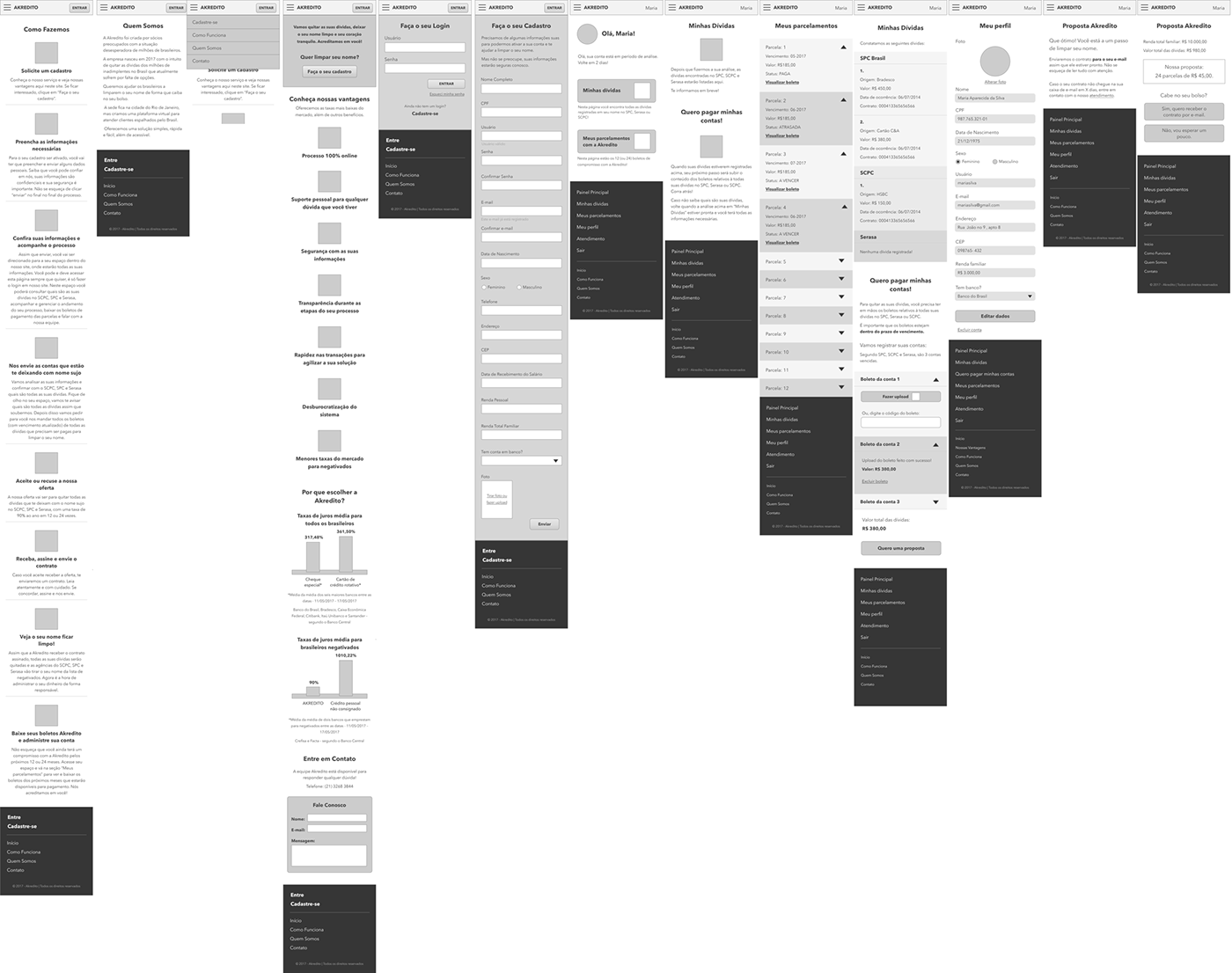
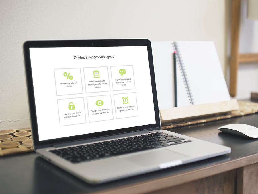
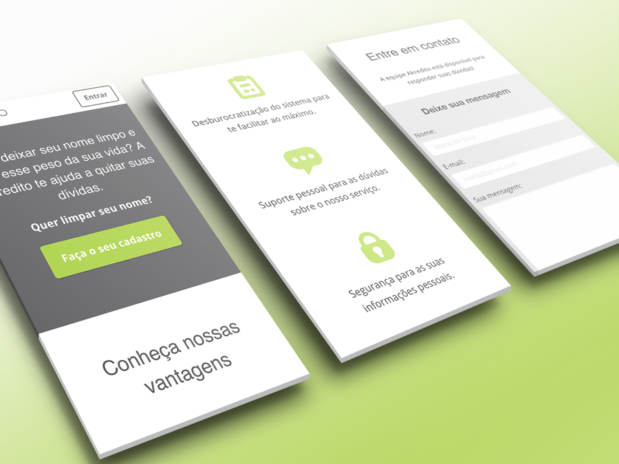
In sequence, the UI was designed according to the wire-frames, respecting the brand guidelines and making it appropriate to the audience and objective in question. Most of the differences between mobile and desktop design concerned only the sizes and positioning of elements. One of the greatest differences was the decision to remove the landing page’s background photo when in a mobile device to reduce the mobile data requirement.
After all screens were properly validated with the client, the implementation process began. The work was done in parallel by me —implementing HTML, CSS and some JS parts — and my teammate programmer, who took care of the back-end and complex details of the front-end programming.
Design challenges
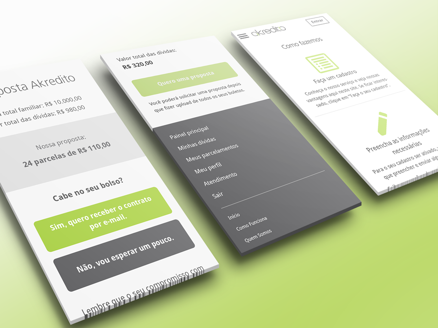
One of the biggest challenges on this project was the fact that the provided service required (by law) a huge amount of information from the user. As a consequence, the UX of the “sign up” form would never be a really good one.
The chosen approach as to make it as easy as possible for the user to fill it up without any doubts or without much difficulty in understanding how the input fields worked. Constraints were applied in all applicable inputs, such as numeric ones or fields for which the number of characters is known. Regular drop-downs were preferred instead of other stylish solutions and all fields had placeholders to show what was expected from the answer. Even though the photo input field was easy to be used, the registering process would not be broken in case the photo wasn’t sent properly — otherwise, the limited internet access of users could result in a negative experience of not completing the register process after a long time filling up a form.
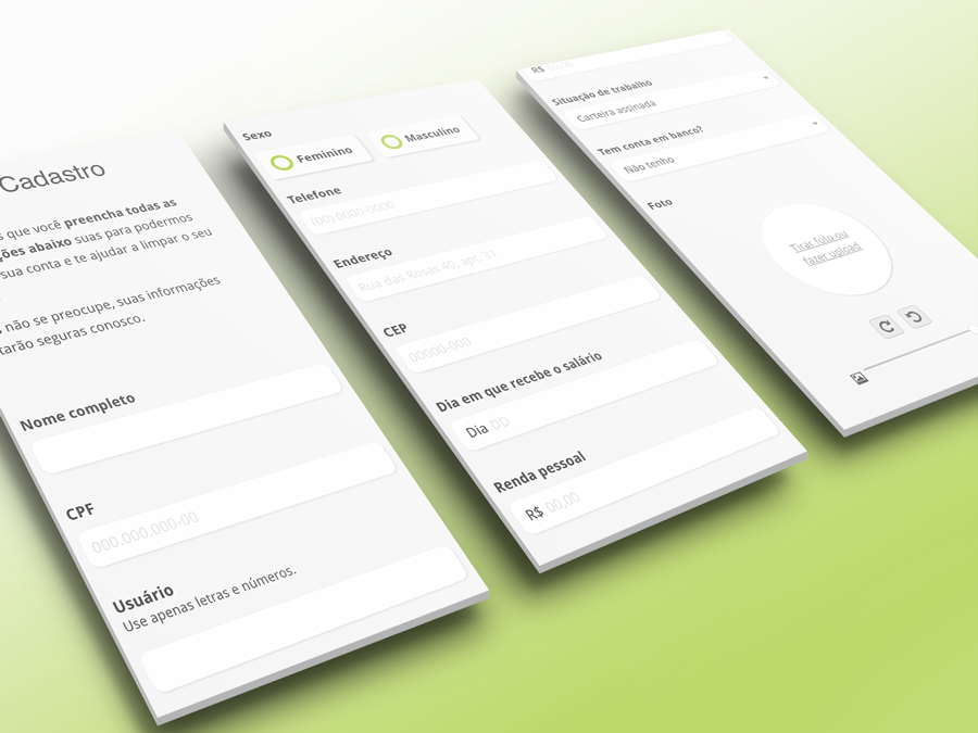 Registration screen
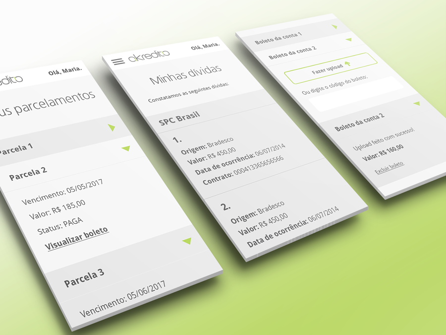
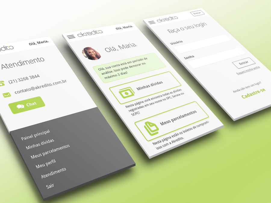
Apart from that, the user flow was quite simple and all stages were properly informed via feedback and the current user status was always shown in their dashboard.
The company is still working and its website can be visited here: https://akredito.com.br/.