The patestevao.com redesign: a case study
30 January, 2020
On the previous version of patestevao.com, I had taken the site as an opportunity to play around with CSS flexbox, which I had waited until then to try out to avoid the poorly supported phase of the feature. And I also decided, at the time, for something that required less technical effort, which led to the website with just two main pages.
So, naturally, I had been feeling the need for a redesign for some time now. Not because I suddenly got tired of CSS flexbox, but because I wanted to design something more fit-to-function, at the same time that I’d make my website a conscious mirror of my professional style and values.
This is a brief overview of how the previous version of the website was organized in its two main pages:
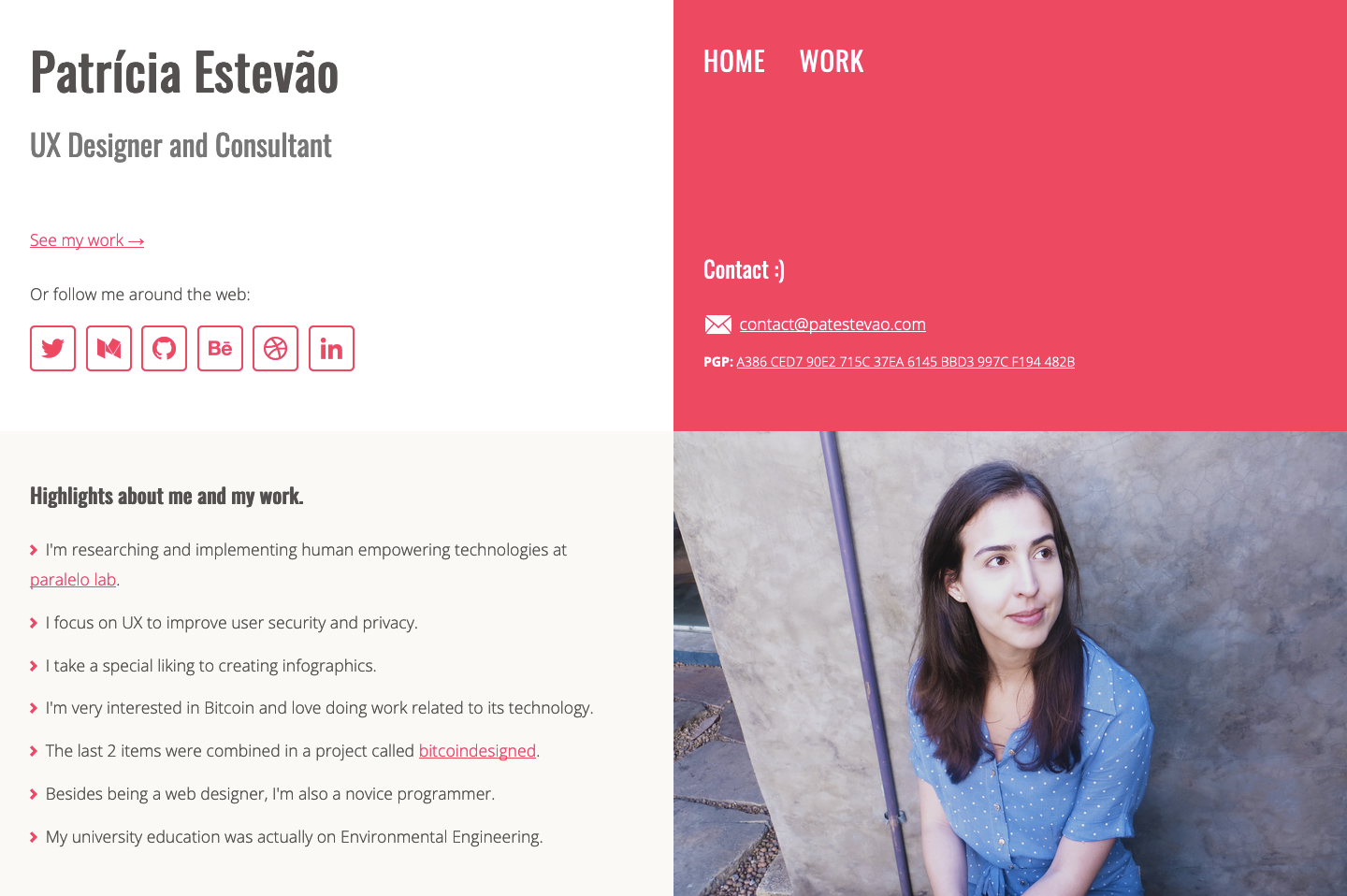
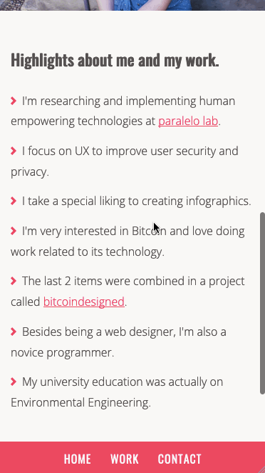
Home: My name, brief presentation, social media links, contact info, and links to work page and external projects.
Work: a hub of external links to other services Behance, Dribbble, Gitbook, Youtube, Vimeo, Google Drive, and Imgur. Also, contact info and link back to home.
To achieve that personal reflection with the new design, there were a few key aspects I had to take into consideration throughout the redesign.
1. Usable before edgy.
2. Security and privacy-focused design.
3. Design on the right scale.
For the rest of this article, I’ll elaborate on what those principles mean to me and how they guided some of the choices behind the new design for patestevao.com. It will allow me to share a brief and contextual overview of my Design mindset and process.
1. Usable before edgy
Aesthetics play an important part in the design and some experimentation can be interesting to make the design stand-out. That said, I refuse to compromise basic usability aspects to achieve “coolness”. I don’t care how chic a light gray text looks on a white background. If it becomes an encumbrance to readability, dark gray will have to do the job. This mindset was always with me during the creation process, along with the basic principles of good usability and some very useful standards in web design and navigation.
So here are a few decisions on which I took into consideration basic usability aspects:
Colour contrast
For all the main written content of the website, I’ve used high contrast colours, essentially black text on white background, but with the right softness in the shades so it was not as aggressive to the eyes. So, in practice, I opted for a very dark grey text in a very light grey background.
The other colours used in text elements (buttons and links mainly) are compliant with AAA accessibility standards when we consider both the shades and the size of the type with which they are presented.
Typography
Apart from very specific elements, such as the date label for posts, all text is presented with a size of at least 18px. Also, line lengths, letter-spacing, and leading are all composed to provide a comfortable reading experience.
Performance
The site was kept as lightweight as possible by optimizing content, such as preview images, and by reducing the necessity of very specific and individual CSS styling rules.
In addition to universal design principles, I also took into consideration who my main user is, what are their goals when coming to my website, and, therefore, how could I create an architecture that was both intuitive and informative for them.
Architecture
The content of the website is divided into clear categories that can be reached through the standard top navigation. Also, the homepage works as a brief presentation page, with a concise but powerful context presentation of the website that the person has just landed on.
If you look at the overview structure of the previous version, you’ll be able to perceive a few relevant usability issues. In the following paragraphs, I’ll state what those issues were and how the new version addresses them.
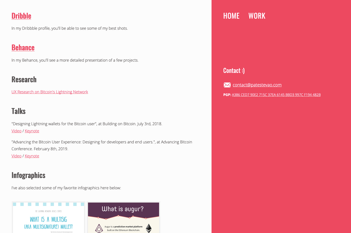
1. The hub of external links
I was forcing people out of the website every time they wanted to see the actual content. E.g. if they wanted to see my portfolio, they’d have to go to either Behance or Dribbble. This would certainly make the navigation back to the website much more costly, creating friction that many people would just not surpass. Besides, there’s also the discomfort and perceived insecurity of being constantly redirected to places you were not actively seeking to go when you first arrived at my website.
After the redesign, I’ve curated my articles and projects, choosing a relevant set to keep in the spotlight. This curated content was then made as accessible as possible from within the website, restraining redirections to third-party websites to a minimum amount.
2. The hidden articles
The only previously existing mention to my articles, which are an important communication vehicle for me, was a link to my Medium account, using merely the Medium logo as a visual cue, and placing it along with all other social media links.
As said above, articles were part of the curated content I chose for the website. The particular thing about them is that they got for the first time a listing page of their own, given the relevance they have as means to convey my design thought process. Besides, the three most recent articles are featured on the homepage, as a suggestion of the type of content that my visitors might be interested in.
3. When did I start working exclusively with infographics?
Since they were the only pieces of work that had image previews available, infographics were at the very spotlight of the “work” page. Even though infographics are something I very much like to work with, they are not my main specialty and line of work. Therefore, my old work page was somewhat misleading.
 This navigation sample shows how much the infographic work would stand out due to the scrolling area it occupied.
The work page now features my curated projects, all with preview images of equal hierarchical importance. Also, the list of infographics was condensed into one single work project, as to not give disproportionate importance to them just because they are more numerous.
2. Privacy-focused design
A very personal aspect of my Design work and that I want to stay true to is the interest in designing for user’s privacy and security. As such, I had the added challenge of doing my user profile study without resorting to privacy-breaching techniques such as collecting information about users with analytics services. I understand it’s an information source that many companies are not willing to give up on but, when it comes to my portfolio website, I absolutely can manage without it. So it’s not only a matter of consistency with my proposed values but also basic respect that I like to show to the people that visit my page.
What I resorted to, as an alternative to collected user-data, was the creation of an “experience-based” persona. This means I designed the website having in mind a lot of different people that I have met and that have had reasons to enter and explore my website in the past. I like to think of it as a compilation of past user interviews.
In addition to not actively collecting information about my visitors, I also committed to creating an experience that wouldn’t “punish” my users for wanting to protect their privacy. This means that all main functionalities of my website will work with plain HTML and CSS. I might add some punctual JavaScript in the future for small improvements but nothing will break catastrophically if you decide not to run it.
And a final concern about my user’s privacy was first thought as a usability improvement, but it serves the privacy purpose just as well. By adding the main content I wanted to share with my visitors to the architecture of the website — mainly my articles and portfolio highlights — I removed their necessity of navigating to a third party website who wouldn’t necessarily share my perspective about user privacy and would most likely collect information about the people I redirected there.
3. Design on the right scale.
One essential aspect of my design process for any kind of solution is to ask myself: what I’m designing for? Is this a multi-national e-commerce or a local store? Is this a company that uses its digital platform as a key part of its business or is the website just a brand display with some basic information?
I know these questions are important in a very obvious way, which is to explain the concept of what I have to build. But now I’d like to focus on one important aspect that comes from these answers, which is the scale for which I have to build and, consequently, what should be the scale of the design I’ll be creating.
In this website, the scale I’m aiming for is the simplest possible.
I don’t have tons of products to display, complex operations that need to be performed, or anything of this sort. My website is a display website. Therefore, I gave myself no excuse to make the site heavier or harder to maintain than it should be. In fact, I made it a personal exercise to reduce the CSS styling rules to the bare minimum, avoiding the complexity of maintaining a large set of rules, but without losing the power of a proper hierarchy and the communication of function that comes from the styling of elements.
This has all to do with performance, which I’ve already mentioned in a previous section. However, it’s not limited to that. It’s really about building a design system with the appropriate scale for the problem we want to solve. Not more nor less than what it needs to be.
But what about showcasing my design skills? I could say that all this meticulous consideration put into such a perceptibly simple website can be a very good way to showcase that, simply because I’m not hiding behind a pretty interface. And, of course, more elaborate interface designs can be found through the samples in the work section of this website.
Conclusion
This is certainly a very simple project, there’s no intention here to pretend otherwise. And that’s all the more reason to take it as an opportunity to share some process samples and methodologies in a light and easily comprehensible way. A Designer’s mind should work the same way in its foundations, no matter the size of the problem ahead.