The Dark Side of UX Design — Part 2: Learning in Practice What NOT to do with your Users
07 February, 2018

Featured picture by: Julian Fong
In the first part of this article, I showed you how changing our consumption paradigms in the beginning of the twentieth century has influenced the way we present products and services. The UX design of today reflects the concepts of this new form of propaganda, which means establishing a connection between products and feelings/sensations. This approach can make your design stand out by offering a good experience to the user and harvesting good results for the business. Or, it can be used to manipulate and confuse the user, tricking him into making decisions that benefit the company in spite of himself. This second scenario is a case of UX dark patterns.
Here in part 2, I’ll give real life examples of how companies have used and still use these dark patterns. Whether it’s an unintentional miscalculation or not, these practices jeopardize the experience and should be publicized whenever possible. This way, the user can be prepared and avoid becoming a “victim” of an obscure design. After all, there’s no reason for us to sit and wait for companies to help us if we can take the precaution. At the same time, this “public shaming” also works as an incentive for businesses to avoid or forsake this fishy approach.
Hall of Shame
To illustrate cases of dark patterns, I’ll base myself on the Dark Patterns project (1), which has the objective of listing and making public some situations where companies used the design to trick its users. This “hall of shame” is here exactly to warn users and to create an incentive for businesses to change their posture.
Some of the examples were taken from the site darkpatterns.org, as well as the categories, while others were written based on my own experience. When talking about these second cases, I’ll be able to share some of the frustration caused by the use of dark patterns.
Bait and Switch
The user intends to do something but, instead, something different and undesirable happens.
Microsoft, 2016
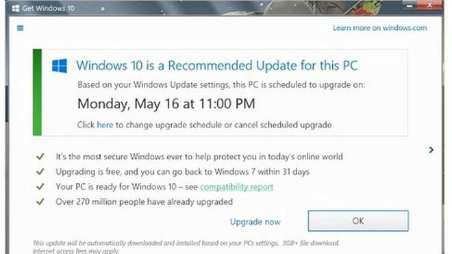 Windows 10 upgrade Pop-up — Microsoft, all rights reserved. Image from BBC
This issue happened last year and got Microsoft in a tough spot. The software upgrade to Windows 10 was offered through a pop-up that automatically opened within the system. If the user clicked the “x” with the intention of dismissing the message, the upgrade would start automatically. 😲
Disguised Ads
As the name suggests, this pattern is adopted so that ads are disguised in the page, as if they were a part of the regular content or navigation. That is supposed to make users click them more often.
Baixaki, 2016
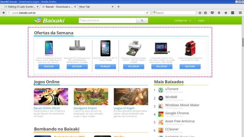 Screenshot from Baixaki highlighting the disguised ad
This pattern is very common on free download websites. My example is from Baixaki, a very well known Brazilian website where you can find a diversity of applications to download.
No need to understand Portuguese here. You can easily see that the highlighted area (the one with pink dots around it) has the same design style in its title as the other sections. However, while the links from the other sections let you navigate inside the website, the links from the highlighted area take you to a sales page elsewhere.
Forced Continuity
The user subscribes to a free trial period of a service and is forced to give his credit card information when registering. When the trial ends, the service starts billing automatically without giving proper notice and without providing a simple and quick way to cancel the automatic renewal.
Amazon, 2015
This was a problem that I personally experienced when I subscribed to Amazon Prime’s free trial period. Like most things that you only use once, I completely forgot about it. The reminder came with the shock of seeing my credit card account: US$99.00, if I’m not mistaken, for the annual plan.
I’m not gonna lie, it was very easy to cancel and ask for a refund, I merely had to send a message to their support service pleading something like “please, please, help me”. But the fact that I didn’t receive any reminder about the trial expiration in the first place and, as a consequence, I had the shock and the need to communicate with their support service, were enough UX breaches for me to remember it as a bad experience.
This type of situation highlights the advantages of payment methods which would require me to actively pay a certain amount. I’m talking about things like invoices and, particularly, Bitcoin. But most services don’t offer these options and force you to give a credit card number at registering.
Forced Disclosure
The site gives you something “free” or low-cost and, in return, wants you to expose excessive personal information that is totally unnecessary to the process. This is a very common pattern for companies whose main income comes from selling its user’s information to advertisers — best case scenario. Another variation of this happens when businesses want to know their (potential) client’s profile — this can be quite annoying but, apart from your experience, no one gets hurt.
Linkedin, 2015
Have you ever tried to use Linkedin without giving it access to your email account and all its contacts? Well, this guy Dan Schlosser did the experiment, and you can see the whole saga in his post (2). TECHNICALLY, you can use the service without handing all your contacts but, with every new click, it takes you to a page asking if you are really sure you don’t want to do this. It’s hell. So you’ll probably end up “collaborating” and adding a giant list of contacts — yes, even that support girl you asked for help that one time will be on your suggested connections.
You’ll then hope it doesn’t make you send invitations to all of them. Which takes us to our next pattern…
Friend Spam
A website asks for your e-mail, Twitter, Facebook or another credential saying it will use it for login or for some other purpose (like finding people you already know in the service). And, without making it clear, it publishes content or sends messages on your behalf (yes, pretending to be you).
Linkedin, 2013
Disclaimer: This example was reported on that same article I mentioned above (2) and the company has already changed the behavior.
Hey, it’s Linkedin again!
We are already at that stage where we handed over our contacts to Linkedin. Now it wants us to connect with “people we already know” and. To accomplish that, it asks, again and again, to send people invitations to connect with you. What happened a few years ago was that there was absolutely no distinction between your e-mail contacts that were already on Linkedin and people who did not have a Linkedin account. So when you thought you were connecting with Mary, presupposing she was already on the social network, Linkedin was actually sending her an e-mail saying you were inviting her to create an account. The bottom line was: they were basically spamming your contacts saying it was you.
Hidden Costs
This occurs when the user goes through multiple steps in a checkout process and, when he gets to the end, he discovers new and unexpected costs were added to the total amount (fees, delivery costs, etc.).
Airplane tickets in Brazil, 2016
I’m not sure if this happens in other countries but, in Brazil, airline companies and websites that sell tickets from multiple companies are masters of hidden costs. Let’s take a look at my experience in the journey to buy a ticket to São Paulo at a website called decolar.com.
 Screenshot of the website with my pink highlight
“Hey, that’s round trip ticket to São Paulo for 171 BRL (Brazilian Reais), that’s a good deal.” Then, I click the link and begin to choose between different days, depart times, companies, the number of stops, etc. With every aspect I carefully choose I become more susceptible to make the purchase because of the time and effort I have already dedicated to it.
To be completely honest, they have this little gray warning here:
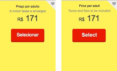 Left image: Original screenshot; right image: my translation for you :)
But no warning could prepare you for this:
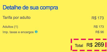 Screenshot of the website with my highlight in pink
The “taxes and fees” represent an increase of more than 50% over the initially announced value. That great deal I thought I’d get just got almost 100 BRL more expensive.
I’m not blaming the site decolar.com for the incredible amount of government taxes charged in every plane ticket here in Brazil. However, the fact that this information is hidden until after the user has already dedicated time and effort to the purchase can be considered a dark pattern.
Misdirection
The user’s attention is guided to a specific place so he won’t notice something else that is happening.
Software installation, 2016
One of the examples from the darkpatterns.org website was the Skype installation on Windows (3). But I decided to make it a broader example because this has already happened to me and other people I know when installing many other applications. After all, who never installed a completely harmless program just to find out later that your browser’s default search engine is now Bing?
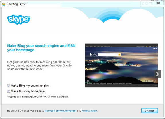 Screenshot of Skype’s installation — Skype, all rights reserver. Image from: Skype Community
In many cases, the installation occurs in a pop-up window, where you have to read and go through multiple steps, configuring options when required. But every UX designer knows that people don’t read, they scan. I’m not saying it’s a habit that should be encouraged, but it’s reality. And, if I know this, I’m pretty sure the designers for these installation processes also know it.
What happens, in the end, is that people only look at the window for enough time to find the buttons that will make the installation go through and they click “ok” or “next” without giving it much thought. Throughout these windows, it’s common to see some other software or plug-in being “pushed” to the user, as they leave the option that accepts these programs checked by default. When speeding through the interface, the user doesn’t realize that he accepted something unexpected.
Privacy Zuckering
This dark pattern was named after Facebook’s CEO (Mark Zuckerberg) because it was first identified on Facebook. It’s about tricking the user into publicly sharing more information about himself than he really intended to. It’s different from a Forced Disclosure because, instead of making you decide to share your information (even if you are not happy about it), Privacy Zuckering is about not knowing exactly what you are sharing or how to avoid it.
Facebook, 2010
It appears that, in its early days, Facebook was full of tricks to make it confusing for the user to understand what he was sharing and how could he manage privacy preferences. It was some kind of virtual saga in which the person had to explore and go through multiple pages. The EFF (Electronic Frontier Foundation) even thought it was worth a tutorial (4) to overcome the UX difficulties.
It seems that this “privacy management” is a lot more clear nowadays. But let’s not forget that the whole social network is a disrespect to the concept of privacy. From reading everything you write (even messages that you don’t send) to the bizarre access to your smartphone’s microphone (5), privacy clearly isn’t Facebook’s forte. For those that would like to know more about the subject, I strongly recommend Richard Stallman’s article (6) about how we are Facebook’s “useds”.
Roach Motel
This is about those services that are super easy to get in but a nightmare to get out. We can consider: large periods to process an account deleting, complicated ways to ask for cancellation (sometimes requiring that you call them), ignoring or returning an error when the user asks to shut down the account, etc.
Mail lists, Always
Remember that cursed day when you accepted to receive some service’s newsletter? Or worst, that day when you didn’t accept anything but had to use an e-mail to register and the service felt entitled to spam you? Or still, that day when you started receiving spam from a service you had never registered with (and you realized other services were selling your contact information)? Yes, newsletters are a great way to communicate with leads, I’m not against them at all (I even have one for my company). But they can become a hell on Earth if the business only has its own interests in mind.
Three things have already happened to me regarding mail lists and the last I saw happening with someone close:
- The propaganda e-mail didn’t have an “unsubscribe” link.
- The unsubscribe link was there, but it always took me to a 404 error page.
- I was able to complete the unsubscribing steps, but the service ignored it and continued to send me e-mails.
- Spam from services never used began arriving constantly.
Trick Questions
The user must answer a question (usually during check-out) that, at first sight, seems to be asking something when, in reality, is asking something else. It’s another pattern that exploits the fact that we don’t read pages very carefully.
Sky, 2015
This image from Sky’s checkout speaks for itself:
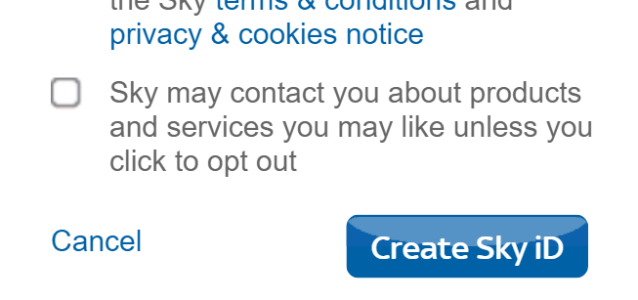 Screenshot from Sky’s check-out, image from http://darkpatterns.org/skys-marketing-preferences-puzzle/
It’s an opt-in/opt-out checkbox that isn’t checked by default. You would think that was a good sign, but let’s not get ahead of ourselves. The sentence says:
“Sky may contact you about products and services you may like…”
It looks like we already know the end of the sentence. I would be at great risk of not going any further than “Sky may contact you…” and leaving the option unchecked. Then, comes the ending:
“…unless you click to opt-out.”
In other words, you not only can be tricked for not reading the whole sentence but also for not understanding it right due to the purposefully confusing construction. For once, not wanting to receive propaganda means checking the box.
Sneak into Basket
The user tries to buy a product. However, during the buying journey, the site sneaks a new product into the shopping basket. This is normally achieved using opt-in/opt-out options that are checked by default.
Active.com, 2015
I don’t really know this company so I’m going to tell its story exactly as darkatterns.org describes it.
Active.com allows you to find and participate in sports events. At the end of your buying journey, you verify the basket’s content, agrees to a bunch of terms and shares your billing information. That’s when a screen with a pretty small text shows up saying you agree to pay for a premium subscription — Wait, what?
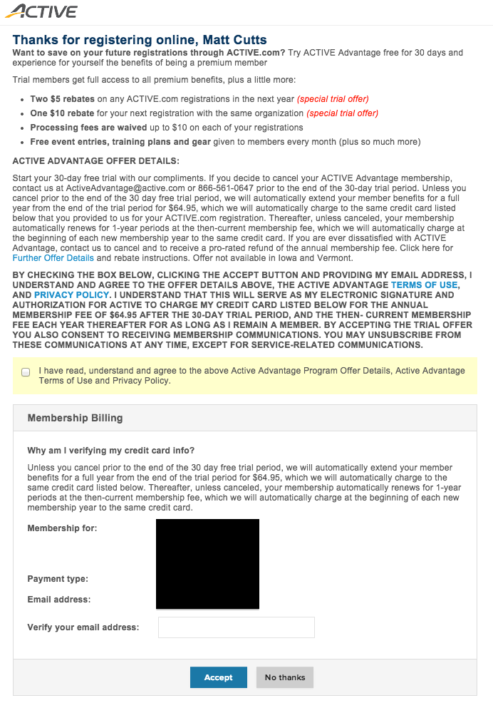 Terms of agreement from Active.com including a premium service you did not choose. Image from: darkpatterns.org
Going to the Light Side

I really hope you find this Hall of Shame useful so that we, as users, can face the design dark patterns with minimum trouble.
As for companies, I’d like to make myself very clear. No insult is meant here. On the contrary, I have my own company and therefore know that some decisions must be made in favor of financial sustainability. Nevertheless, these decisions will not be worth it in the long run if they are made in spite of our client’s best interest.
Finally, a message for my fellow designers: think about what it means to be a designer. We should help a product/service to communicate to users what it is, what is it for and how to use it. That is, we are mediators of this relation between a person with a problem and the product that’s going to solve it. The dark pattern corrupts this mission as it takes the problem resolution (the user’s interest) out of the equation, making no sense at all. After all, we don’t want to be designers that only make things look pretty.
References
(2) https://medium.com/@danrschlosser/linkedin-dark-patterns-3ae726fe1462
(3) http://darkpatterns.org/skype-install-invisible-checkbox-set-bing-my-default-search-engine/