Lightning Network UX Research
25 November, 2019
Summary
- Introduction
- Resources and Methodology
- Objectives
- User Personas
- Objective one: Current state of development
- Objective two: Visualizing the user interface
- Objective three: review of current interfaces
- Conclusions
Introduction
Authors
The research was conducted and the resulting material was written by Patrícia Estevão, which had the full support and technical advisement of Marco Agner.
License
This material is licensed under the terms of the Attribution ShareAlike 4.0 International (CC BY-SA 4.0).
Summary
As the Bitcoin Lightning Network comes to life thanks to the work of various professionals that committed themselves to make it happen, the need for an interface that will communicate the technology to users also arises. Throughout this study, we will discuss what is the current situation of that interaction between users and Lightning payments; we will comment on the design process of creating an interface thinking about the people for whom it is for and, consequently, propose the main elements that should figure in a usable application; and, lastly, we will review three different existing projects (the wallets HTLC.me, Zap and Eclair) that are still on development but are some of the main known efforts for creating user interfaces for the Lightning Network.
Timeline
The research and the preparation of this written material were conducted between February 16th and the end of March, 2018. The timeline below gives a sense of perspective with two other important events for the Lightning Network development.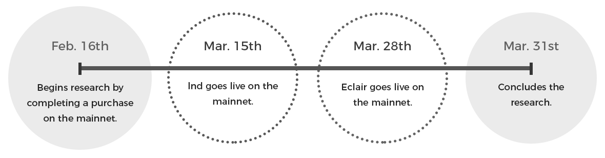
Motivation
As a new piece of technology that is to be plugged on Bitcoin, the Lightning Network has the potential to vastly improve Bitcoin’s — and, possibly, other cryptocurrencies that adopt it — scalability and user experience by creating new possibilities and use cases; which concedes it enough relevance to be specifically researched in order to improve Bitcoin and related technologies as a whole.
My objective with this compact study is to contribute with the Lightning Network adoption and user experience by analyzing some of the expected changes — if any — in usability that may be felt by users and presenting some possible approaches to make this adaptation a smooth and comprehensible process.
Resources and Methodology
The research was carried out by one professional UX designer (Patrícia Estevão) with previous knowledge of Bitcoin’s workings, assisted by one professional programmer (Marco Agner) with a deeper technical understanding of Bitcoin. There was no budget or greater resources to be applied and the hardwares used were personal laptops, where the needed software was installed to create the Lightning Network transactions.
The method of UX research chosen was the Heuristic Evaluation.
“Heuristic evaluation involves having a small set of evaluators examine the interface and judge its compliance with recognized usability principles (the “heuristics”).” - Jakob Nielsen (1995)
There were two main reasons for that choice:
- The scarcity of resources to be deployed wouldn’t allow for a complete research since methods that include a interaction with system users (usability testing, field studies, focus groups, etc) require a financial investment.
- The current state of the Lightning Network isn’t that of a product that can be easily tested by users. The possible actions are still very limited, there’s no functional user interface and the difficulties one encounter require specific knowledge to be overcome.
The heuristics or principles of User Interface Design used as guides for the analysis were as stated by Nielsen (1995), and can be listed as follows:
- Visibility of system status
- Match between system and the real world
- User control and freedom
- Consistency and standards
- Error prevention
- Recognition rather than recall
- Flexibility and efficiency of use
- Aesthetic and minimalist design
- Help users recognize, diagnose and recover from errors
- Help and documentation
The summarized explanation for each principle can be found in the author’s article.
In order to guide the evaluators, the research also included a simplified construct of user personas and journeys. They were formed based on a general manifestation of the user’s profile and objectives which can be taken of public space discussions such as social media.
Note on the moment chosen for this study
One might ask if it was a good choice to carry out such a study right now, as the current state of the Lightning Network implementations and interfaces is still premature.
When we talk about the creation of a product/technology, many cycles compose the development process, from the conceptualization to the usable version, passing through sketches, brainstorms, tests, implementation phases, etc. And the concern about the user experience is as much a part of all these steps as the writing of code itself. That is, if the desired result is a product that can be used by its public audience. That’s because design decisions about how the interaction should be implemented are occurring all the time and, the sooner misconceptions are discovered and turned into better decisions, the easier it is to transform the product. That’s why it’s worth it to do this UX review even if there’s so much unfinished and unpolished. We hope that giving some insights in this early period, we’ll be helping the software creators to point their efforts in the right direction.
Objectives
The goals of this research can be presented as three broad themes:
-
Identify the current state of development of the Lightning Network in relation to how ready it is for regular use (i.e. not only specialized testing) on the mainnet.
-
Visualize how a user interface should be built in order to accommodate the new functions of the Lightning Network and provide a good usability and experience.
-
Review usability aspects and design decisions of the current solutions of graphic user interfaces, taking into account the early stage of development they are in.
User personas
1. John, The computer guy
Back-end developer for an e-commerce company.
John is a programmer experienced enough to know his way around Bitcoin. Although not a cryptographer or a cryptocurrency specialist, he has played a bit with things like smart contracts and wallets. He likes being able to have full control of his installations and software preferences and, in some cases, he might even feel more comfortable with a CLI than with a graphic user interface. He has decided to try to follow a tutorial he found online and be one of the first ones to use the Lightning Network.
2. Luke, The Bitcoin enthusiast
Barista in a trendy coffee shop in Lisbon.
Luke has been watching Bitcoin for a few years now and has seen many of its ups and downs. He’s a convict Bitcoin supporter. He doesn’t know many technical details, but has already used a variety of different wallet apps and is always tuned in what’s new. Now, he’s eager to try the Lightning Network and experience the “instant coffee buying” but he has no idea of how to use the CLI. So, even though he’s willing to be one of the testers and even to risk a small amount of money, he needs a graphic user interface to do it.
3. Jennifer, The mainstream user
Content Marketing manager at a digital agency.
Jennifer got to know Bitcoin at the end of 2017. There was so many news talking about it that she just couldn’t ignore it. She has heard a few explanations about what it is, but the only one she could truly relate to was from a comedian that said: “It’s everything you don’t understand about money combined with everything you don’t understand about computers”. A friend of hers from work has promised to show her how to download an app to try it out. She wonders “How difficult can it be?", after all, she uses all the new apps she can get her hands on so she believes she’s used to new technologies. At this point, she has never heard of Lightning Network.
For the definition of the user personas, the stereotypes considered were those of the expected users of the Lightning Network, not simply of Bitcoin. That’s why, for example, there’s no persona for the Bitcoin trader character, since he’s trading activity is not particularly important in the Lightning context. In that case, his actions will be similar to other types of users, such as John or Luke.
Objective one: Current state of development
The first part of the research followed the available scenario of usage (as of mid-February 2018) of the Lightning Network. It was composed by the installation of the necessary software and performance of an economic transaction using a Lightning payment channel. The implementation used was the c-lightning, as it was, at the time, easier to use as a mainnet client than the other well-known alternative (lnd). As for the transaction itself, it would be a payment to the Blockstream store. Once an order had been successfully placed, the objective would be accomplished.
During the exploration of this scenario, it was clear that, at this point, the only user who would be able to perform the necessary operations was John, leading to the perhaps obvious conclusion that the technology is not usable for less technical users, even if they are willing to go through some risk.
Even though a tutorial was partially followed for the whole task, there were a few problems encountered along the way that required extra effort and previous experience to overcome them. Apart from navigating the website for the purchase, all the actions were direct commands in the CLI. The requirement for specific knowledge was considered by the evaluators as a natural constraint of the development process that, in fact, avoids that unprepared users are exposed to the risk of financial loss. In other words, those who can’t perform the operation shouldn’t be using the technology yet.
Nevertheless, the task was successfully carried out through these steps:
- Set up Bitcoin Core (bitcoind), have it synchronized with the mainnet and running.
- Install and configure c-lightning (lightningd):
- Create wallet
- Run it connected to bitcoind
- Get
newaddrand fund the lightningd wallet. - Wait for confirmations of the funding.
- Connect to another node.
- Set a transaction fee for the Bitcoin node.
- Open and fund a Lightning Network channel with a well-connected peer.
- Go to Blockstream’s store, add items to basket and proceed to checkout, where you get a Lightning payment request.
- Decode payment request, find a route and send the transaction.
The process is not particularly complex for users who know how to use the wallet through the CLI, but all the others (Luke and Jennifer) will have to wait until they are able to use it. In addition, the moment now is essentially for tests and development of new solutions and structures. Even for technically-able users, the system and the tools that surround it are still too risky to be considered ready for use.
Objective two: Visualizing the user interface
The stage of restricted use and high risk described in Objective 1 is expected to end in its due time when the development reaches a more mature state and the Lightning Network will evolve to be part of regular user interfaces, as it is the case with common Bitcoin wallets. The mental exploration of what those interfaces should look like is the second objective of this study.
Phase 1 wallets
Let’s call the stage with no user interface available the Phase 0 of the Lightning Network development. Phase 1 would be, then, the following stage, where the first interfaces are already functional and compatible with the abilities of the 3 described users.
This is a period when all the operations that were done through the CLI in the first part of this research are properly integrated into a graphic user interface. On the other hand, there might be quite a few structures for the Lightning Network that are not yet built or are not completely mature (e.g. automated network discovery systems) and to wait for the integration of these systems with the regular wallet’s APIs and functions might result in delaying the launching of usable Lightning wallets. Also, it will take time for the Lightning-enabled wallets to be considered really battle-tested and, during this period, a series of bugs and unexpected behavior might come to light. As a consequence of those two aspects, it makes sense that the first wallets to be made available are especially dedicated to Lightning operations and not general purpose wallets. That is both because of timing so that Lightning wallets can start to be used and tested as soon as they are sufficiently secure and functional, and because of the security risk of adding new features with unknown effects in a wallet holding the user’s main funds. The ideal and general purpose wallets will be described further in the Phase 2 wallets section.
The general consequence in terms of User Experience is that, even though all 3 typical users will be able to use the wallet, the extra learning effort of having a specialized wallet for the Lightning Network might alienate the third user, Jennifer, until the next phase. Also, this will mean that actually two blockchain transactions will be required to open the first Lightning channel (and subsequent channels in case the wallet runs out of funds), since the user will need to send a regular Bitcoin transaction to fund the wallet and then a second transaction will be made to open a channel. However, this is considered a minor problem given the above-stated reasons for adopting this type of wallet while the Lightning development matures.
What will not be left for Phase 2 is the ability of wallets to bootstrap themselves and automatically manage channels without the requirement for user input. The importance of this aspect lies upon the fact that, when the user doesn’t need to manage his channels manually, the main break on his mental model of how a Bitcoin wallet should work gets out of the way. Or, in case of a completely new user to cryptocurrency, such as Jennifer, the learning needed to get the first transaction going is smaller and more intuitive (send and receive transactions). With time, the user can get curious and understand what the channels section is about and how to operate it, but it doesn’t get frustratingly in the way of regular payments.
In order to imagine what the wallet should look like, we are going to do a task analysis of three main flows of action that need to be contemplated:
- Wallet Setting
- Sending payment
- Requesting payment
The guidelines and wireframe sketches on this section are limited to specific tasks and situations that were prioritized in the explanation, but this doesn’t mean a real implementation of a Lightning wallet should limit itself to only these operations. They are purposefully low fidelity drawings, in order to focus on the elements and the general architecture instead of aesthetic aspects of design. In addition, the suggested structures are not being presented as the only forms of designing good user interfaces, they are just an approach to visualize the elements that should be prioritized when doing so.
Setting up the wallet
The first flow is common to all Bitcoin wallets, not only the ones for the Lightning Network. Nevertheless, it’s such a crucial part of the interface that it will be included here anyway, with the following sketches and items being used to highlight usability concerns of this implementation.
- Setting up the wallet for the first time (same as to regular Bitcoin wallet)
- A choice between creating a new wallet or recovering an existing one.
- Chooses to create a new wallet and the mnemonic code is displayed.
- The mnemonic code is verified.
- Other security setups are offered (passphrase, 2FA, etc).
- The wallet is ready.
Set up pages
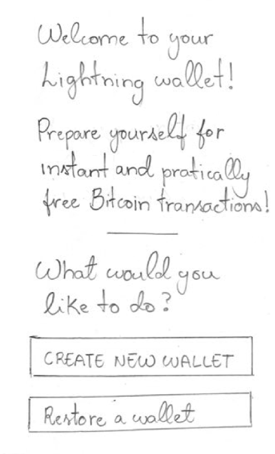
First screen seen by the user.
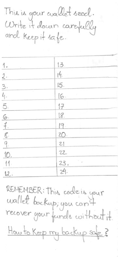
Screen showing wallet seed (after the user chose to create a new wallet).
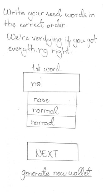
Screen for mnemonic code verification (one word at a time).
Comments about the interface:
- The first screen should be a simple choice for creating or recovering a wallet. With the “Create new wallet” button more prominent since that’s what “clueless” users will likely want to do and they should be indicated that that’s the most common choice.
- Wallet backup should come on the next screen and work as an interlock, i.e., the user should be constrained to begin using the wallet without going through the backup steps.
- The seed (BIP39) scheme is the more user-friendly form of backup.
- Clear but short instructions about what to do with the mnemonic code and its importance should be given. It could be organized in bullet points or other short structure, aided by the use of bold or differentiated characters to highlight important parts. A link to a more detailed explanation of how to make a safe backup is a good call and should be more prominent than the text, but less than the list of words. That way it gets user attention but doesn’t distract the person when she’s writing down the words.
- The mnemonic code should be organized in a clear way, with no ambiguity in the order of words and, preferentially, numbered (so the user can see more quickly if he’s missed a word).
- The software should avoid triggering the mobile behavior of capitalizing first letters or take care of the input normalization in the backend, as it would make an otherwise valid word appear as invalid, causing user confusion. Another option is to prohibit the user from writing anything that isn’t a valid word from the mnemonic code. That can be done using the property of the mnemonic words, which can be identified after the first 4 letters are written.
- The verification of words is important to make sure the user didn’t make a mistake in the copying process. All words can be requested, one at a time, or an incomplete list can be shown for them to complete the missing ones. The later will be more effective in the verification, although it will require more time and effort from the user.
- Wrong words, i.e words different from the one expected for that input field, should be highlighted readily after the user writes them and not only when he tries to verify the whole list (this is especially valid in the cases the interface is not asking one word at a time).
- A list of suggested words based on the partial user input can accelerate the verification process and give a quicker feedback if he has the correct words.
- An option to generate a new seed should be available in case the user realizes he’s made great mistakes in the copying process (or maybe he tried to skip the copying altogether because he thought he could get away with it).
- Other security setups might be prompted to the user, such as password settings and 2FAs, but he should be able to go through without completing all of them (given that the proper warning is displayed) and he should be able to set those up at any time in the settings section inside the app.
Making a Payment
The second flow consists of sending a transaction in the Lightning Network. This scenario counts on the user having external access to the payment request he wants to send money to.
- Wants to send a transaction via Lightning Network.
- Opens payment section.
- Pastes/writes/scans payment code/address.
- Writes amount to be sent (in case it wasn’t specified in the payment code).
- Optionally, writes a label for that transaction.
- Hits “PAY”.
Payment page
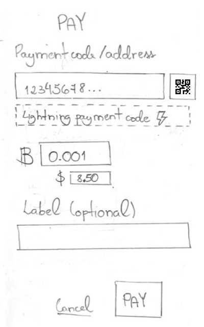
Screen for making a Lightning Network payment.
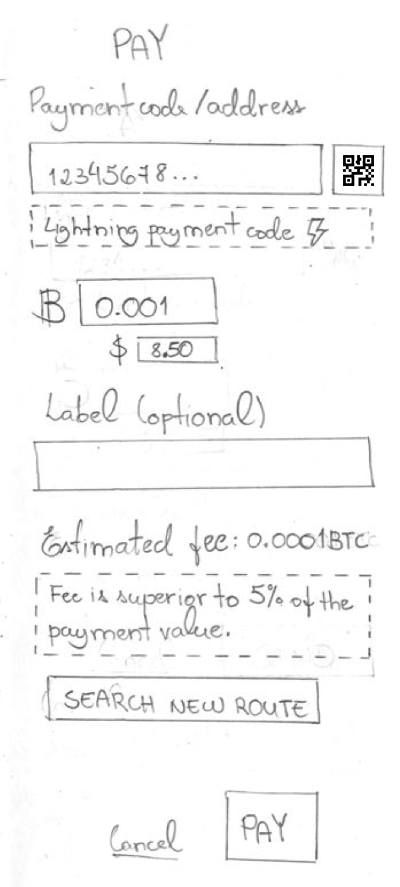
Screen for making a Lightning Network payment with the warning of an expected high fee.
Comments about the interface:
- The multiple options of scanning a QR code, writing, or simply copy/pasting the address that should receive the money are already widely adopted in Bitcoin applications, but it’s important to mention them as best practices, anyway.
- When the user inputs the address or lightning payment code, the wallet should promptly give the feedback of what type of address it is (Lightning or blockchain).
- The idea of a self-bootstrapped wallet is that it will connect itself to a number of relevant peers in a way that, in most cases, there will already be a route for any payment the user might want to make. Nevertheless, it might come a time, especially in these early stages of the network, that a path can’t be found and the wallet will need to open a new channel before doing the Lightning transaction. In that case, the best option is to warn the user that the transaction will take longer and require an extra fee because it will need to make a blockchain transaction to open a channel.
- As it was already stated, the process of opening new channels should be automated by the wallet’s backend, removing any burden from the user having to perform this operation manually. Nevertheless, the user should be able to open channels manually if he specifically desires so. The suggested structure for how this feature should be implemented will be discussed further.
- The fee estimation for the route chosen by the wallet’s backend should be displayed with a warning if the fee seems too high. The definition of a high fee could be a market-established one that is used by default, with the possibility for the user to set his own threshold in the settings section.
- The amount can be written in the Bitcoin field or in the fiat currency field, with one autocompleting the other using the current Bitcoin price. Both the fiat currency and the unit of Bitcoin should be available for the user’s personal configuration in the settings section.
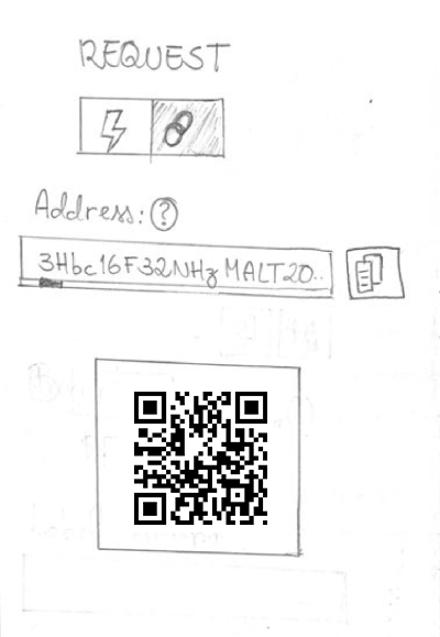
Requesting a payment
The third basic flow to be covered is the request for a payment. The publication of the payment information will be handled outside the wallet client (e.g. sending by e-mail), unless the payer is physically present and, consequently, able to scan the QR code information.
- Wants to receive a transaction via Lightning Network
- Opens request section.
- Optionally writes amount to be requested.
- Optionally writes a label for the request.
- Clicks “REQUEST” button.
- Sends/publishes payment request.
- Waits for payment to be completed by the other party.
Request page
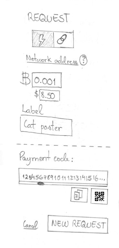
Screen for making a Lightning Network payment request.
Screen for a blockchain payment request, i.e. getting an address.
Comments about the interface:
- Like the PAY section, it should be possible to add the amount in fiat currency or BTC. The one provided will be used by the wallet to autocomplete the equivalent amount in the other currency based on updated price.
- The top of this section should present an easily perceivable choice between “Lightning payment” or “Funding wallet” in case the user wants to see a blockchain address to add funds to the wallet. The default, however, should have the Lightning payment selected, since it’s the main use for this wallet.
- When the “Funding wallet” option is selected, the screen should show a regular Bitcoin request, with a blockchain address available to receive transactions.
- When “Lightning payment” is selected, a link to show the “network address” may be available, in case the user wants to share his peer’s address as a way for others to open a channel directly with his client, even though this is considered an advanced feature.
- When clicking the “REQUEST” button, the payment code should be displayed on the same screen so that the user can double-check the information he provided previously. But the information should not be editable anymore, to make it clear that he will have to generate a new code in case any input changes.
- A link to “generate new request” should be provided in case the user does want to change any of the inputs. By clicking it, the input information should become editable again (preferentially not being erased) and the previously generated code should disappear.
- The payment code should be selectable (for copying).
- It would improve usability to also have buttons with the appropriate icons for directly copying the code and for showing its representation as a QR code.
Extra pages
Dashboard page
Now that the most basic flows were covered, let’s take a look at other relevant pages, starting with how the dashboard page (the main page the user sees when he enters the wallet) could look like.
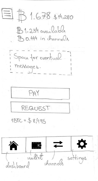
Screen for the dashboard (home) page.
Comments about the interface:
- The PAY and REQUEST button should be the more prominent elements of the screen since they are the main actions a user would need.
- In the case of desktop or browser wallets, it would be best to make the PAY and REQUEST button available on all screens. This might not be optimal in mobile wallets because of limited space and clutter.
- A summarized display of the wallets funds should be seen, with the separation of total funds, available funds and funds committed to Lightning channels.
- The main items to show in the navigation are dashboard page, Wallet page (where all transactions can be seen), Channels page (where channels can be seen and managed) and Settings page. These items should be visible for an easy discovery, while other necessary items can be less visible if there isn’t much available space for displaying or if there are too many items and a visual hierarchy has to be applied. For example, if building a mobile application, the four main items could be in a tab-style navigation, while the others could be in a hidden menu.
- This page is also where general warnings and messages should be prompted to the user, such as that a new version is available or that some setting should be reviewed, etc.
- The current exchange price of Bitcoin might also be displayed in a more subtle manner, as this is still considered a relevant information by most users.
Wallet page
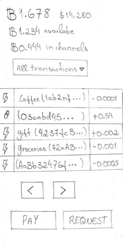
Wallet screen, i.e. where transactions are listed.
As for the “wallet” page, where transactions will be shown, the main issue is to make a differentiation between lightning and blockchain transactions. Other options such as being able to filter transactions by type (blockchain, Lightning Payment, Lightning request, all Lightning) are also nice to have. Apart from that, the already established best practices for displaying transactions should be applied, such as ordering from most to less recent, showing number of confirmations, displaying the chosen label (when there is one), giving a link to a block explorer service, color coding money that has been received and money that has been sent, etc.
In this particular sketch of a mobile wallet, the transaction rows are links to the expanded transaction information, due to the lack of space for directly displaying everything.The last page to be analyzed will be the Lightning channels section. These are the most important elements to be considered:
-
List of channels with information about the peer, amount committed and the current status of the channel.
-
The possibility of manually opening a channel with a specific peer.
-
Filter for channels based on their status would be a nice to have.
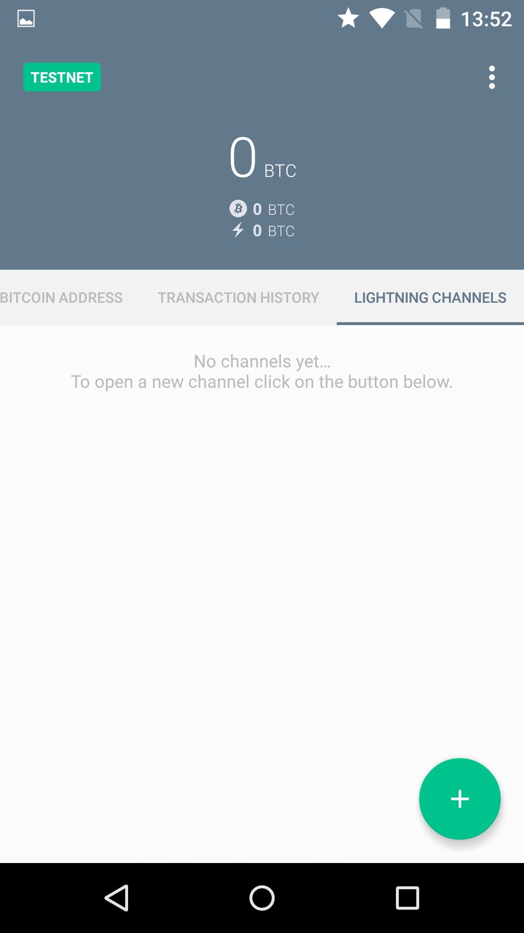
Channels page
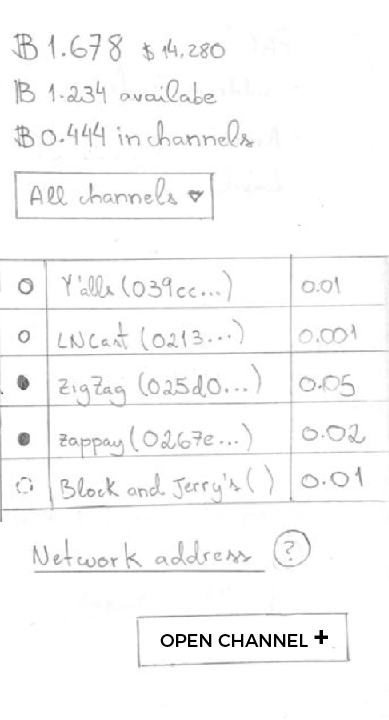
Channels screen, i.e. where open channels are listed.
In the Lightning channels section, the most important elements to be considered:
- List of channels with information about the peer, amount commited and the current status of the channel.
- Possibility of manually opening a channel with a specific peer, even though it’s an advanced feature and should be treated as so (for example: give the user a warning about the operation or only making this option available if the user enables it on the settings section).
- Make available the user’s network address with a small explanation of why the user might need it (represented here by the interrogation mark that can be hovered on or clicked).
- Filter for channels based on their status would be a nice to have.
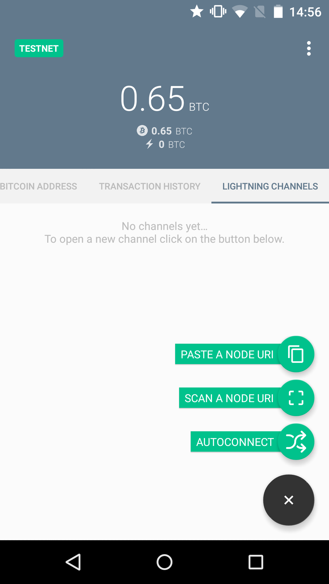
Open Channel page
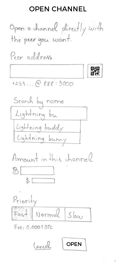
Screen for opening a new channel manually.
At last, we get to our final screen, which is where the user is able to manually open a new channel. Due to the risks associated and the particular difficulty in understanding the information on this page, this is considered an advanced feature. However, it’s important that it’s included in a Lightning Network wallet, even if, as suggested above, it’s a page that needs to be deliberately enabled in the settings page.
The main elements that should appear here are the following:
- An input field for the peer address with a numeric representation of what is a peer address, like a placeholder. The user should also be able to scan the peer address that can be provided by third parties as a QR code.
- A field for searching the peer by name. It’s not as reliable as the previous but it can make the identification of the peer a lot easier if the peer in question has an alias set for himself.
- The amount that the user wants to commit to the channel with the proper conversion to fiat currency.
- A conventional choice of the transaction priority, since it’s a blockchain transaction, with the expected fee being updated depending on the priority choice. Note that no drop-down option was used here because the number of options is limited to three, so there’s no reason to degrade the discoverability of the values.
Phase 2 wallets
Phase 2 wallets will be the clients developed in a future state of the network when the technology is more mature and battle-tested. In that scenario, the proper interface will not put any burden on the user of having to perform different operations for Lightning or regular Bitcoin transactions. The same wallet will be used for any type of transaction and the same “PAY” and “REQUEST” sections will work no matter what type of transaction the user decides to do. The software will be responsible for recognizing what type of inputs are being given (what type of address/payment code) and act accordingly to the type of transaction that is expected.
Let’s explore the same three activities we analyzed on Phase 1 wallets to see what changes should be expected in this new type of wallet.
1. Wallet setting
It will be based on the same principles, so no further analysis is necessary.
2. Sending payment and 3. Requesting payment
- The basic flow should be exactly the same, only, now, the wallet will have both blockchain and lightning transactions with the same degree of importance to the user.
- On the REQUEST page, a more advanced option of for blockchain transactions should be implemented, giving the user the possibility of creating an advanced request (with the amount already filled in). In order to avoid unnecessary clutter, since it’s very common for users to just want the address, this should be hidden under a “advanced options” link.
- The page for Lightning channels will be less important in the general wallet hierarchy because the opening and closing of channels should be even more seamless for the user. At the same time, it has to continue existing so users can manually open channels if they have that need. The solution is to remove this section from the main navigation elements and put it in a hidden or contextual menu (in case there’s reason for a Lighting submenu).
The conclusion we can take from the Phase 2 analysis is that the main differences will occur in the wallet’s backend and in the conceptual model passed to the user that this is now a general purpose wallet. The interface itself will need very few modifications. Nevertheless, the usage simplification of only needing one wallet, together with the fact that more standards and best practices will have been established by then is the necessary usability evolution that will fully integrate Jennifer, our third persona, as a user of the Lightning Network.
Objective three: review of current interfaces
The final section of this research will go through the current implementations of Lightning Network wallets with graphic user interfaces to point out the main good and bad design decisions that are being made. We have to consider, of course, that all the candidate clients for analysis are in a very early stage of development and are not actually functional yet. Due to that, there will be an effort to differentiate between what seems to be a design choice and what is a temporary implementation bug, since only the former is relevant here.
Another relevant thought is that some of these wallets might have been created with demonstrative purposes only and, because of that, developers consciously didn’t worry about details and usability issues. Even so, they will all be considered here as wallets on the process of improvement, so any relevant issue will be pointed out in a way that it can theoretically be corrected in the future.
Additionally, since the focus of the research is on usability and general user experience on the Lightning Network, aesthetics considerations will only be made when they directly affect those aspects (e.g., a cluttered interface that increases cognitive load, fonts that are too small to read, etc).
Three different wallets will be used (in testnet mode) and compared with the guidelines defined in Objective two.
The scenario followed when going through the wallets was that of the execution of simple expected operations (sending and receiving payments) and a basic exploration of the interface as a whole (visiting and trying to understand the main available pages and sections).
The first important observation is that some of the current implementations do not open channels automatically for the user, requiring them to search for the peer they need to connect to and manually open a channel. This wasn’t even considered as an early development necessity in Objective two because the required network structure for automatic opening of channels already exists as LND’s autopilot feature. Although the network discovery methods will probably improve over time, the removal of the main burden of opening channels manually can begin right now. The expectation of the researcher is that, by the time functional releases for mainnet use are being distributed, this feature will have been implemented by the development team of all these interfaces.
Another general aspect of the current wallets is that, probably due to the early development stage and the fact that they are only being used as testnet wallets, not all of them have implemented a proper set up for the wallet regarding the security and backup. That’s not a big issue if it’s fixed before the wallet becomes usable in the mainnet.
HTLC.me
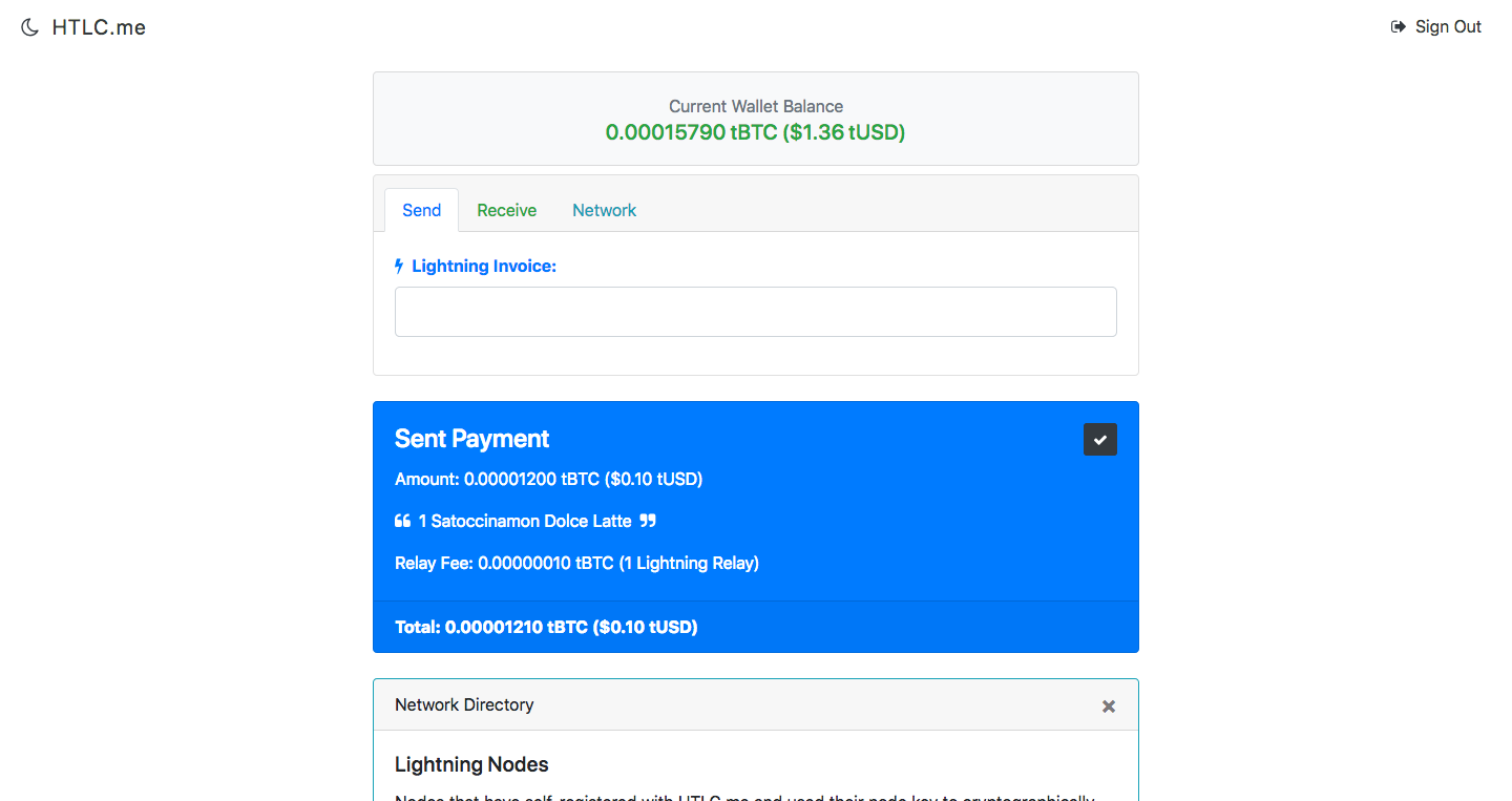
HTLC.me is a web-based wallet created by Alex Bosworth with the basic necessities for the Lightning Network operation. The test described below was conducted with the wallet’s running version in the last week of March 2018 using the Firefox Quantum 59.0.1 browser. The greater perceived strength of the wallet is that it’s very straightforward in its use and its greater issue is the lack of options (user freedom and control) and explanations for each activity. These aspects might be considered a counterbalance to each other and HTLC.me weights too much on the first side.
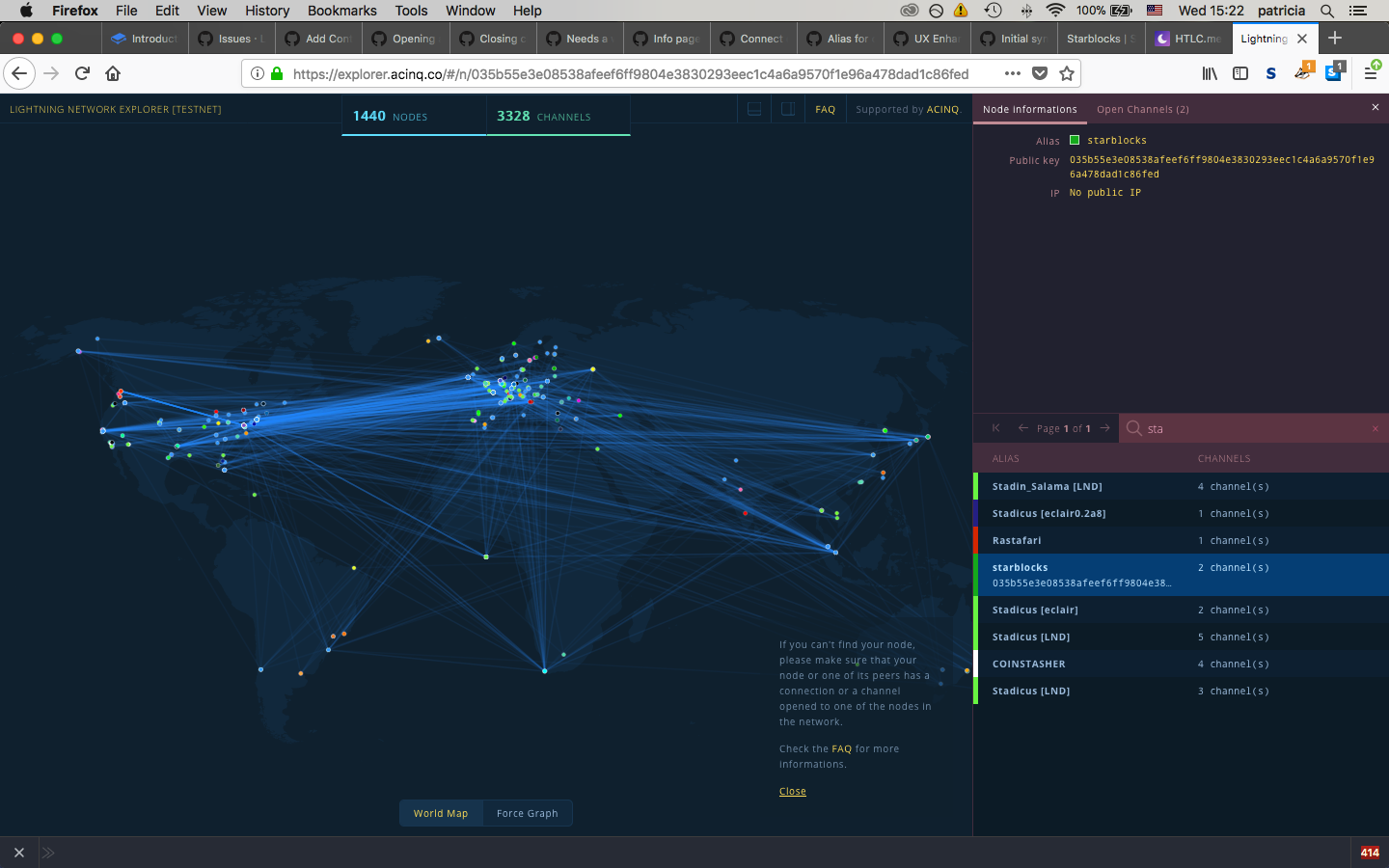
The first screen shows the amount available in a Bitcoin unit and in US dollar, as well as the three main sections of the wallet: send, receive and network. The wallet doesn’t allow a blockchain funding operation, instead, it starts itself with the amount of 0.00016000 tBTC. This is probably due to the merely demonstrative purpose I mentioned before.
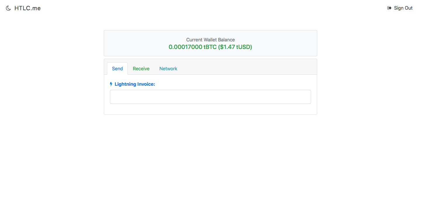
Since there’s no setup process available for this wallet, the first operation will be an emblematic coffee purchase, using the Startblocks demo website. As expected when proposing the wallet’s sketches, the merchant provides both an easy way to copy or to scan the payment code. In the case of HTLC.me, only pasting or writing is possible, a scanning option would need to be implemented.
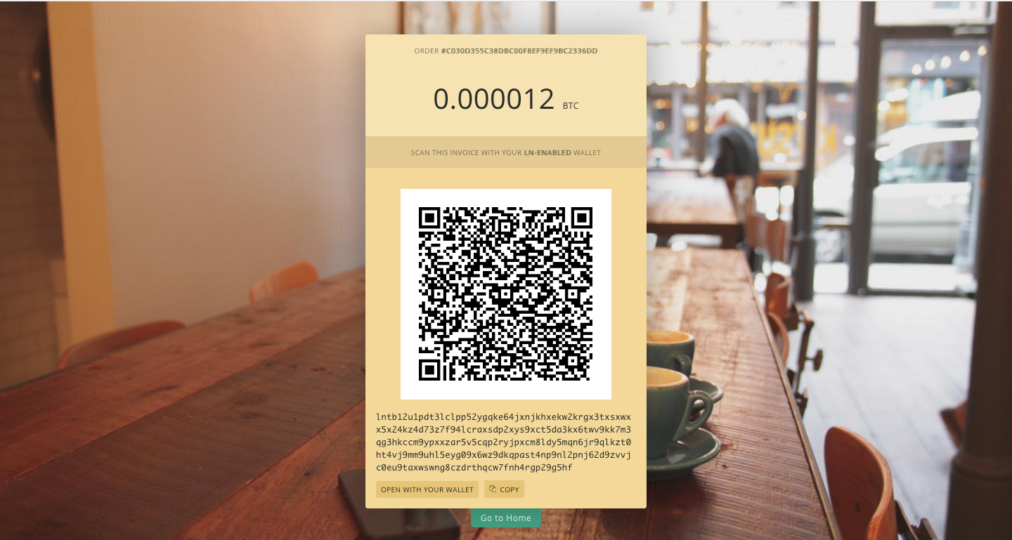
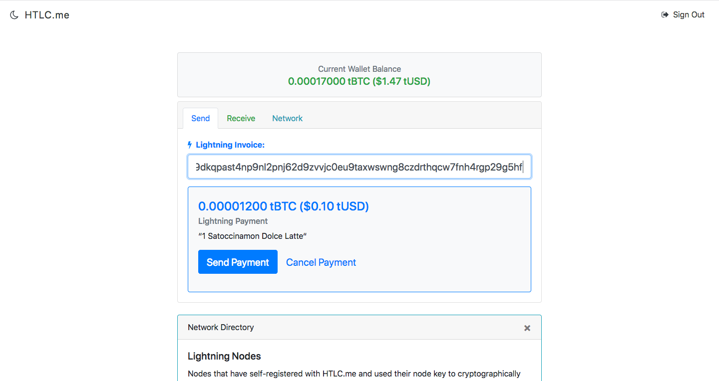
As soon as the payment code is pasted, the available information about the purchase is displayed. It’s a perfectly timed feedback for the user before he confirms the payment.
After sending the payment, a confirmation screen with the transaction details is shown, which is also a proper feedback system. This concludes the first task of sending a payment.
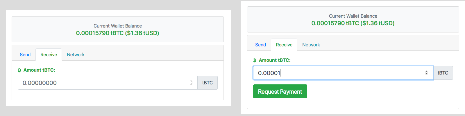
The second step is to request a payment, which is made in the Receive tab by entering the desired amount you wish to receive. Here, an interlock is applied by only making the “Request Payment” button show up after an amount is written down. This is a good application of an anti-affordance (a lack of functionality that communicates the proper behavior) that tells the user that a payment request can only be generated if an amount is provided. On the other hand, it might create a moment of confusion in case the user tries to understand how to generate the payment request before writing anything in the amount field because there will be no available button. A better approach could be to display the button in an “off-mode”, i.e., with a style that indicates that it’s disabled (such as a light/greyish color and no link behavior on hover).
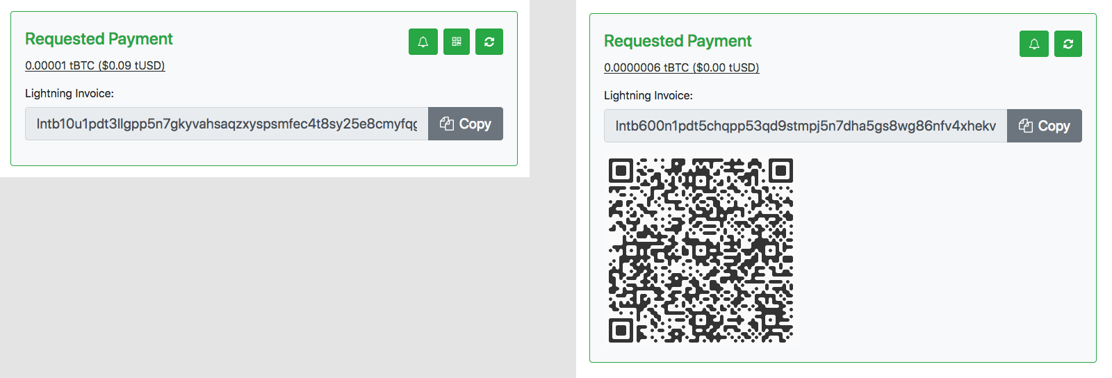
After generating the payment, the code is displayed with the possibility of copying and visualizing as a QR code, as well as with a link that directly opens a wallet application on the device. A notification option (the button with a bell icon) is also provided for enabling browser notification when the payment is received. The button with a “reload” icon was a bit unclear. Its function is to refresh the status of the payment, at the same time that the wallet does this refresh task automatically, so it ends up being a button with no apparent function. Since the button is probably there to cover the case when the wallet doesn’t refresh automatically, maybe there could be a title tag on the image saying “Force refresh”. It would give a better explanation of its purpose.
Here’s the feedback when the payment is received (with enabled browser notification):
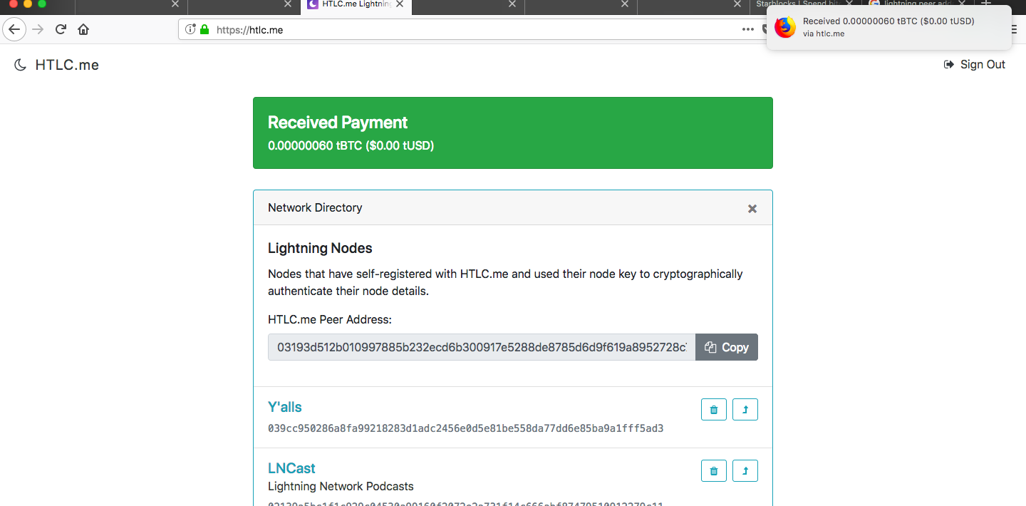
Note that no manual channel opening was required until now. That’s because HTLC.me already starts itself with a list of connected peers, as it can be seen in the Network section.
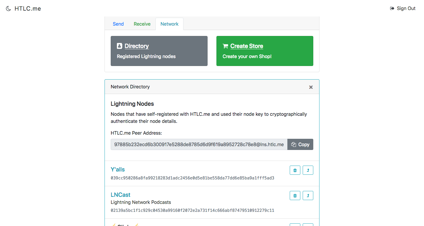
That’s exactly what was mentioned before about removing the burden of opening channels of the user’s shoulders, and HTLC.me does it quite well. What it apparently doesn’t cover is the possibility of a user wanting to open a channel with a specific peer that doesn’t appear in the directory.
The Network directory is also where the user’s own peer address is shown, which, even though is not the placement that was suggested in Objective 2, it’s a place that makes contextual sense.
One last adittion about HTLC.me is that, even though there’s no place to manually add a peer or open a channel in the regular interface, we did find a way to connect to new peers that is only shown in a specific context of the wallet. It happens when the user tries to make a payment but the wallet encounters a network error.
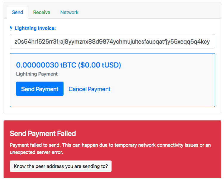
In this moment, the wallet asks if the user knows the address of the peer he wants to pay. If he clicks, he sees the following:
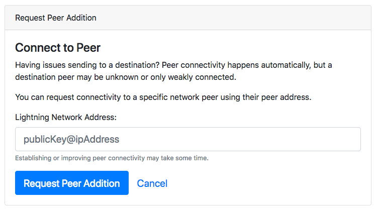
That’s actually a very good context to display this option since it won’t be needed in a regular situation that a path can automatically be found to complete the payment. And it gives a short but good explanation of why that’s appearing there and what to expect.
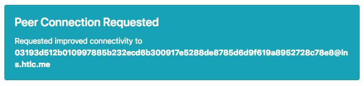
Finally, it gives the feedback after the peer addition is requested.
Zap
Zap is a desktop wallet developed by Jack Mallers and other contributors. Since it is an interface with more features, it naturally will have more elements to be analyzed and, possibly, criticized. It has, at its core, the intention of being user-friendly and the general aesthetic of the wallet is very pleasant. This last aspect is indeed important because users tend to perceive more pleasant interfaces as easier to use, so it’s also part of a better usability.
The software used for this test was the v0.1.0-beta release for MacOs and it was run on a macOS High Sierra v10.13.3.
Beginning with the first opening of the wallet, it presents a dark screen with an animated loading icon that counts a percentage of loading and a carousel structure in the middle with various slides of written content.
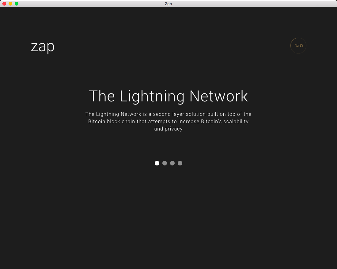
At the time of writing, this first experience with Zap already started with some degree of confusion for the user, because the loading process takes a long time and no explanation was given about what was being loaded. It looks like the user is stuck on the first page. This issue had already been pointed out in a Github issue and it appears that it is going to be resolved with the addition of a “Syncing to the blockchain…” message.
Still on this same page, the carousel can only be navigated by clicking the circles in the center of the page. Those circles convey the message of how many slides there are and which one of them is activated. They do not, however, give the impression of being navigable links. Therefore, the carousel navigability should be improved by allowing direct control through keyboard arrows and by adding some signifier on the screen, such as left and right arrows, to better indicate where one should click to change items.
Also, although the explanation about the Lightning Network is timely and clear, the other elements that are explained ended up being so superficially described that they not only fail to convey a useful knowledge but might even make users more confused. This moment the user has to wait for the syncing could be seized to give a more practical explanation about the wallet and its usage, accompanied by “learn more” links that will lead the interested person into a page with a proper explanation for these technical concepts.

When in the wallet, the first screen to be shown is an empty activity page. A mere suggestion here would be to include small explanations about each section while they are empty, so the user understands what will go where at the same time that gets more information about how the Lightning Network works.
Since the wallet setup flow is not yet implemented, we’re going to straight to the second flow from Objective 2: making a payment. As this is the first time the wallet is being used, we need to fund it with a blockchain transaction. The two candidate elements to perceive this action are the REQUEST button and the Adress button. This trial and error approach to find the correct path is an indicator of inappropriate design choices, as the user shouldn’t have to be in doubt of where to find a way to put money in the wallet. Maybe the labels or groupings should be revised.
We soon find out that the REQUEST section only creates lightning requests and that the Address section is where you can find a blockchain address for the wallet. Now let’s take a look at where it takes us:
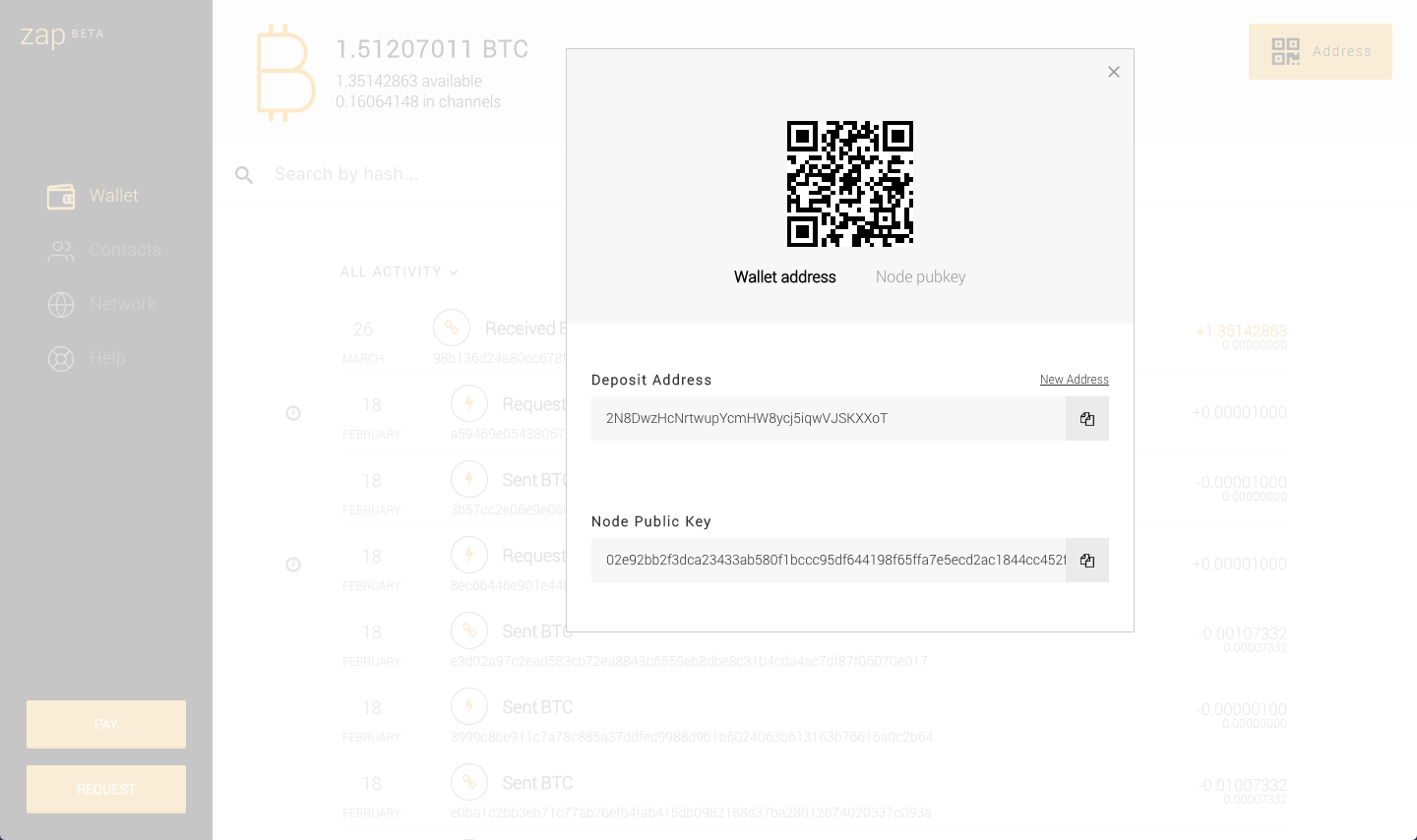
First, there is an inconsistent naming in which the blockchain address of the wallet is called “wallet address” in the QR code section and “deposit address” below. Also, this display is a bit confusing as it is, in practice, divided in “QR code section” and “written address section”. A more semantic division would be “deposit address section” and “node pub key section”, each with a button to show the desired QR code.
Anyway, the required address for a blockchain transaction is there and we’ll use it to fund the wallet. Once that’s done, we can go on with the Lightning payment task.
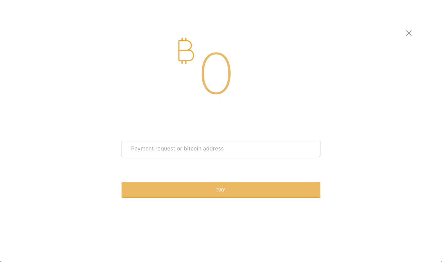
The PAY button is relatively easy to find but it does have a usability problem that’s worth mentioning.


The background color is a light yellow and the font used is white, thin and not very large. That’s quite hard to read, even for someone with an OK vision. It’s an accessibility issue that should be addressed somehow (making the font larger, bolder, changing the font color to dark grey or changing the background color to a darker yellow). The same is true for the REQUEST button, but not for the Adress button, which has a dark grey font.
The payment page is now open.
Again, we’ll use the Starblocks page to make our purchase and get a payment code to paste in Zap.
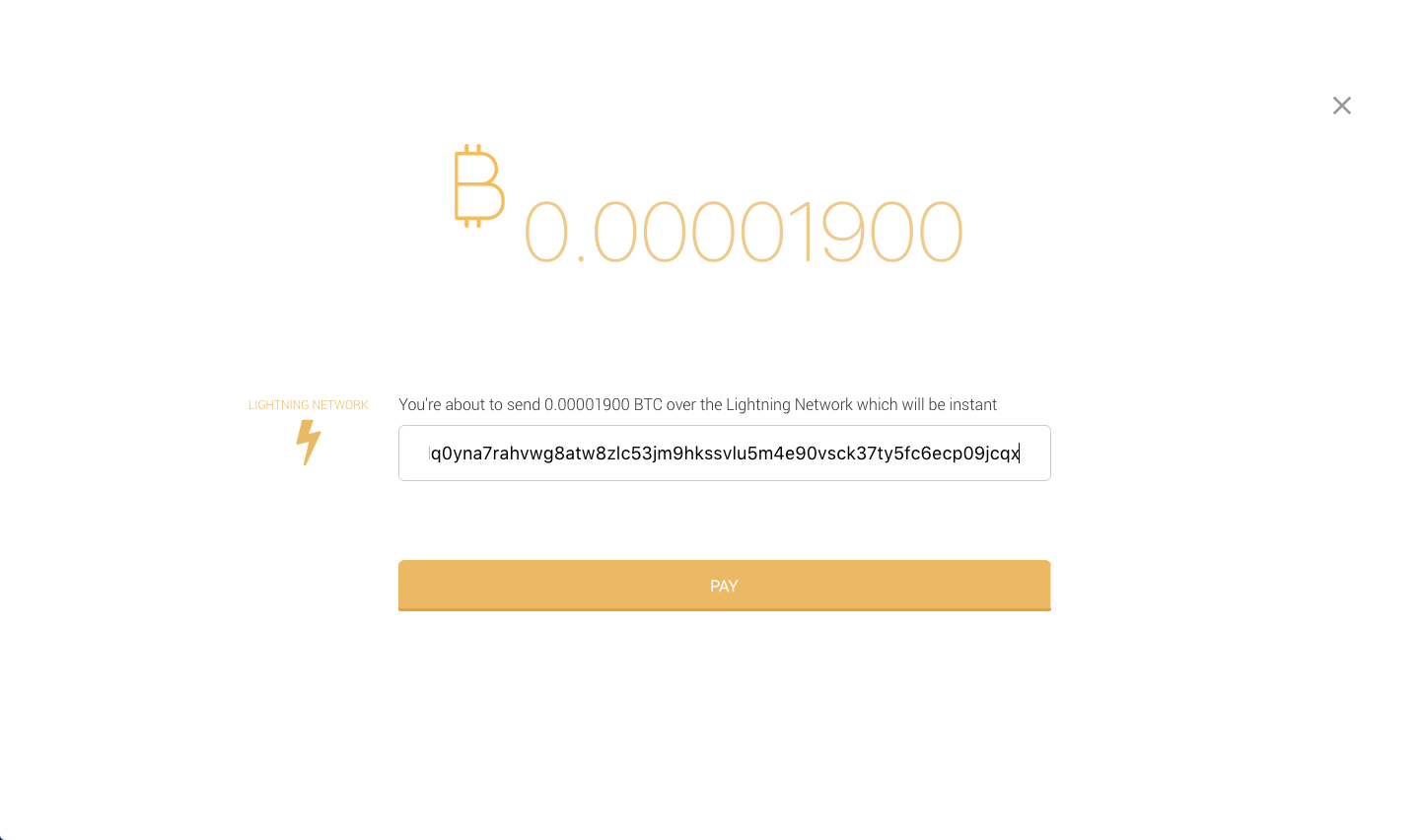
It automatically completes with the amount of the payment and gives the feedback about the code being a valid Lightning Network payment. Although it is interesting that the page is very focused on the minimum of necessary elements, there are some extra information that could help the user, such as the previously suggested conversion of the amount to fiat currency (in a smaller font) and the possibility of adding a label to the transaction, in order to make it easier to find in the future when its listed with many others. After all, a great use case of the Lightning Network is exactly to make various small transactions, so it’s likely that the list of past transactions will be very extensive.
Let’s hit pay.
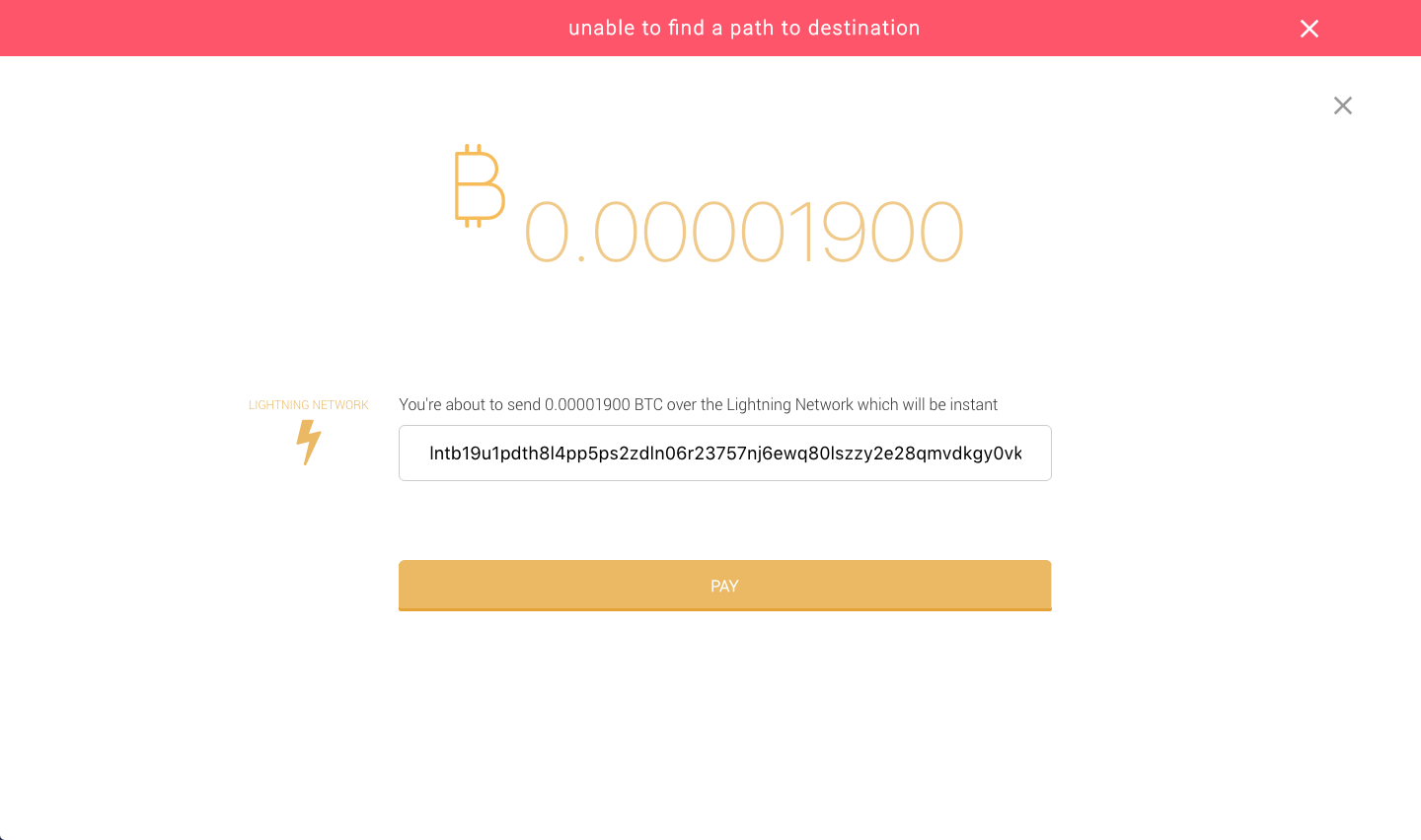
The transaction couldn’t go through because there isn’t a path to the peer we tried to pay. This means that Zap is one of the wallets which is being initially developed requiring users to open their own channels by hand every time they need. We aren’t going to deeply analyze this process because this study’s recommendation is that this situation is reverted before the software is actually released for users on the mainnet. But we’ll go quickly through the steps since they will be necessary to complete the task of sending a payment.
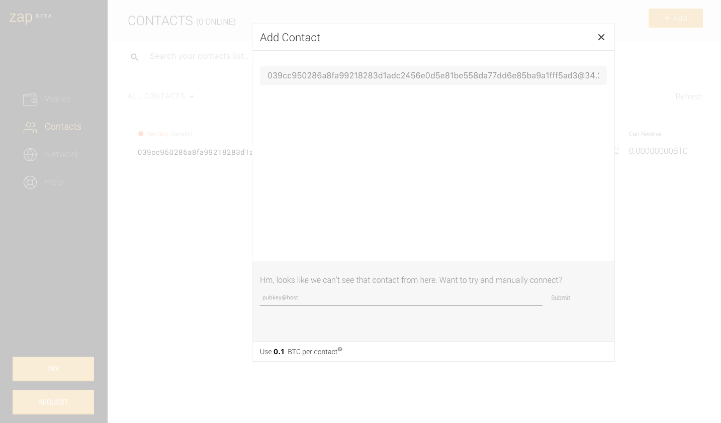
That’s the page for adding a new contact, i.e., opening a channel. Some of the main perceived issues are:
- The contrast in the grey section is very low and one of the main elements of the page, the submit button, practically disappears because of that combined with the small font size.
- The label “pubkey@host” could be more helpful if it displayed an example of the numeric format that is expected, such as “022f0edb0d6a8e19320e949a6f24fd4442c390ba1f38f8349b92ee0ee6cbdece08@35.229.31.135:9735”. The visual cue of what the user is supposed to input is very important if he doesn’t know exactly what he is looking for (as he might not know what pubkey and host are).
- The amount that is to be committed to a channel appears as a small detail on the bottom of the page (it’s shown after the “submit” button) and it doesn’t look very editable. It would be easy for someone to “add a contact” without even noticing that he had a choice there. This is mentioned in a Github issue.
- Even for future wallets where the manual channel opening is less frequent, it would be useful to be able to add an alias or label to a new contact in order to make it more easily searchable and recognizable. This was also identified by someone else and put in a Github issue.
We finally have channels open:
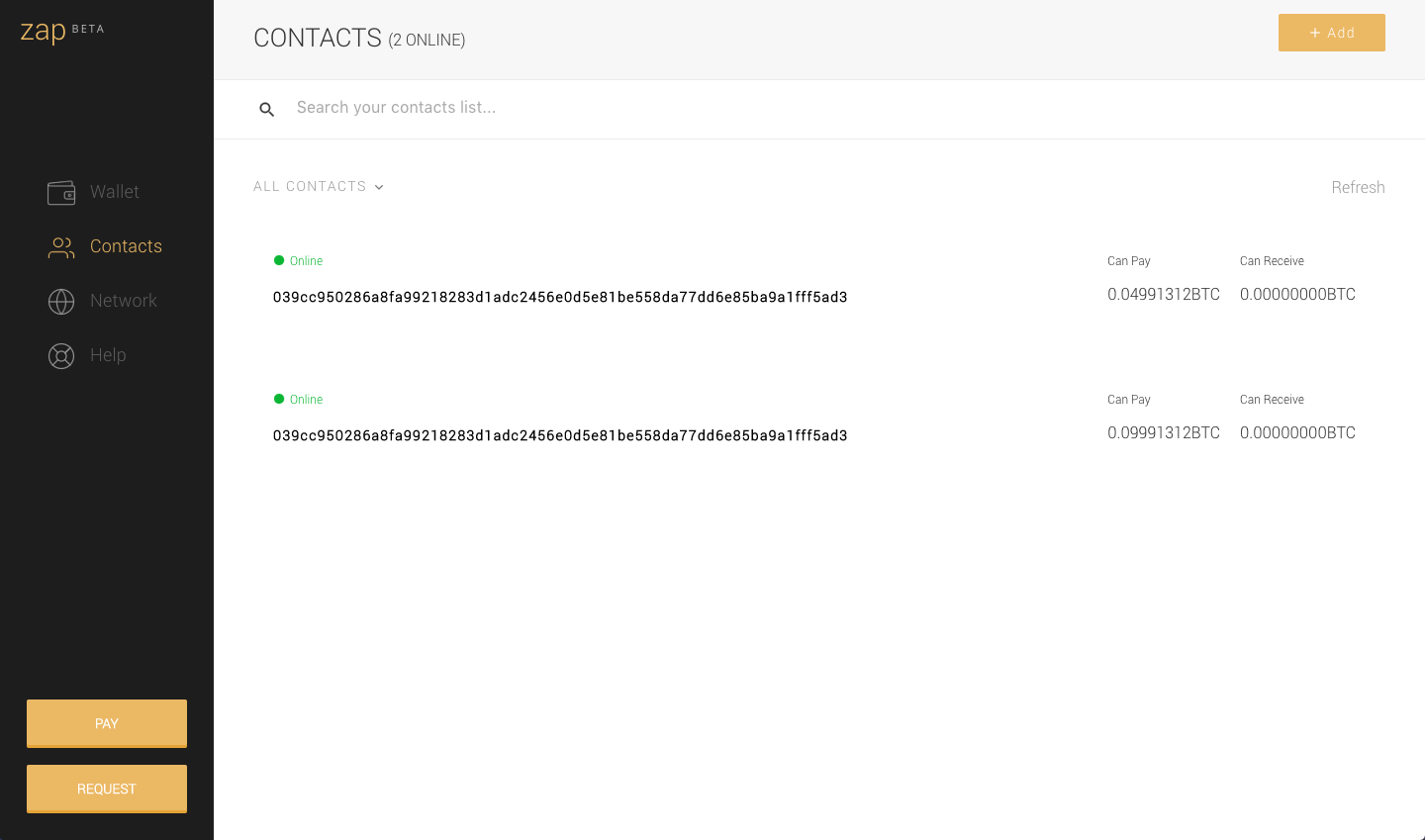
This page of the interface has some very good elements, such as the searching option, a filter for contacts, a refresh option (which could have a refresh icon next to it to call more attention), and a clear display of the state for each contact that is both written and color coded. As for the possible improvements: the already mentioned addition of an alias to each contact and the bad contrast in the “Add +” button (same as in the PAY and REQUEST buttons).
The division of the amount in the channel between “Can Pay” and “Can Receive” is an extra load on the user if he has to keep track of this for every transaction. But in the future case that this page is only eventually used for deliberate manual operations, it can add valuable information.
Now, if we repeat the steps of the payment flow, we will have a successful operation.
Our second task is to request a payment and, for that, we’ll go to the REQUEST page.

Once you fill in the information with the desired amount and label, you should receive a payment request such as this one:
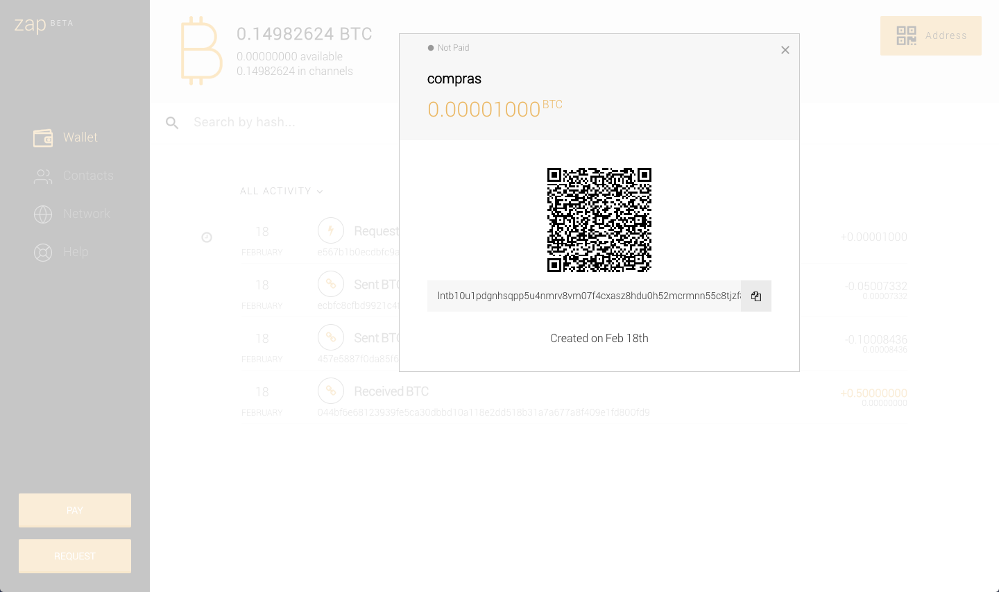
It gives you a visible payment code, an option to copy and to scan, as well as it displays the amount and the label you wrote in the previous step. Besides those basic elements, it also says the date the request was created and its current status (if it was paid or not). It really got all the elements right with the correct visual priority.
With that information, you can share the request with the person who is supposed to pay it and wait for a confirmation. Therefore, requesting a payment was also successful.
After a few transactions, here’s what the wallet page will look like:
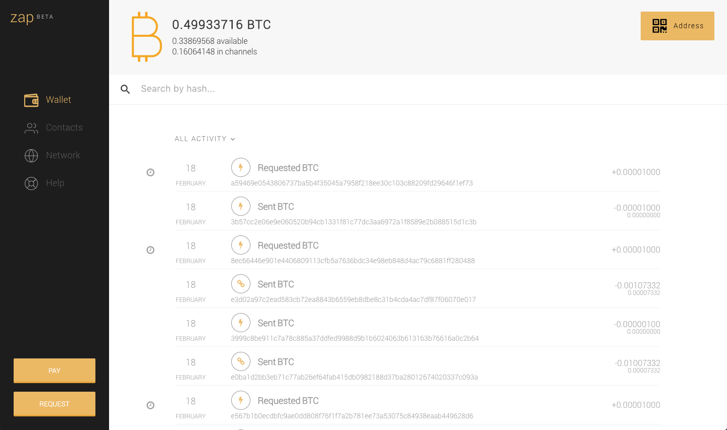
It perfectly represents the segmentation between Lightning and blockchain transactions, although the “Requested BTC” and “Sent BTC” labels get quite repetitive. That space could be occupied by a more informative label that will help the user identify transactions. The knowledge of how much was requested or sent is conveyed through the positive or negative numbers in the right. It would be even clearer if the numbers were properly color coded as well. At the moment, the only differentiation by color is that for the received blockchain transactions.
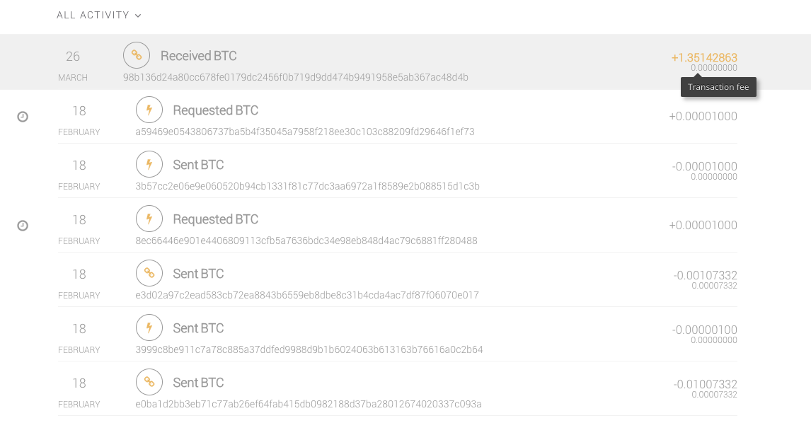
There could be a doubt, at first, about the small number displayed under the transaction amount but that is quickly answered by hovering on the number, which reveals that it is the transaction fee. The date of the transaction is also informed, as well as if it’s still pending (represented by the clock icon that reveals an explanation when hovered on).
The biggest experienced issue here is that unconfirmed blockchain transactions are not being shown, they only appear after the first confirmation. This is clearly a lack of proper feedback for the user that needs to know if the transaction is on its way but, as stated in the Github issue about the subject, it’s probably a temporary bug.
A suggestion for the activity filter would be to create a segmentation in three main categories (All, Lightning and Blockchain) and use tabs instead of a drop-down, which has poorer discoverability. And, when in the Lightning tab, a submenu could appear with more refined options, such as sent, received, pending, invoices and complete. A different suggestion on the same theme was purposed on a Github issue, as well.
With all the tasks completed, some extra comments about the interface are due:

Some messages displayed during the use of the wallet have a funny/playful tone that might not be appropriate to the situation. A wallet is a financial application. The users need clear messages and shouldn’t be put in a playful mood because the operations they are performing might result in financial loss.
There is an issue that will be less frequent with an automated channel management, but it’s an issue nonetheless. If you open multiple channels with the same peer, you have no warning or indication of that, and the channels appear as completely different. That breaks the conceptual model of “contacts” that is passed on Zap, as you can’t have two equal contacts that appear as different entities. That is pointed out here on Github. The suggestion presented by this research is to either drop the “contact” analogy and call it a “channel” or to recognize repeated peers and group its channels under one name/pubkey.
Although not clearly visible at first, a repeated mistake during the wallet’s operation has put to light a possible need for improvement. Both on the PAY and REQUEST sections, the label and payment code are requested as normal input fields, clearly recognizable for the user. Even though the amount is also an input field, it’s shown in a completely different style (very large and colored), which can pass, at first, as a decorative object. It looks very good aesthetically, but it might be more recognizable if it’s displayed in a more input-like style, similar to the other required elements.
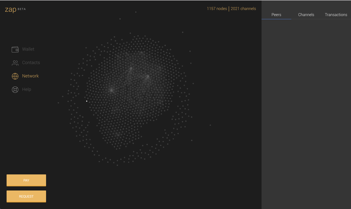
The Network section of the wallet is an interesting visualization model for the discovered Lightning Network and it seems to be going in the right direction in terms of making the map easy to understand and to visualize peer information. It couldn’t be explored very well during this study due to still unresolved development problems, but one observation can already be made: is it really something to be in the same hierarchical importance as the “wallet” section? Especially when the auto-management of channels is implemented, this section shouldn’t be so prominent as it has less practical use on daily user activities.
To finish the analysis over the Zap wallet, a few comments will be made about the analogy system adopted by Zap that refers to channels as contacts. It is, indeed, a way to make users feel more familiar with the operation of the wallet as they use “add contact” features every day in their lives. As for an “open channel” instruction, it requires immediate new learning and it might create resistance.
But, sometimes, the lack of familiarity is necessary for the user to understand that it is something new that he should be paying attention to. For example, the issue with the amount that is committed per channel being too subtle in the interface is exacerbated by the lack of need for it in the contact conceptual model. Why would someone need to choose an amount to add a contact to a contact list? The issue with the multiple channels opened with the same peer also brings confusion, but it could be solved by the appropriate grouping of channels.
Another issue with this analogy is that, when someone thinks about adding contacts, he usually thinks “the more the better” or, at least, that it doesn’t hurt to have a lot of contacts. In this case, it may hurt because you have to commit money to every new contact you add. Also, a person will want to add all their friends and family members as contacts, which is not really useful here and results in money committed to channels, as well.
The moment of suggesting options and trying them out is really now, so Zap’s choice is considerably good, at least for the reason of testing. And, as there’s no such thing as a perfect analogy, the main focus for future interfaces should be to maintain consistency and standards among different implementations. Other faulty analogies are used in Bitcoin systems every day and it appears that users got used to them so far. But that can only be true because they are the same terms for every app (address, coins, balance, etc.).
At the present moment, we suggest the use of a more accurate expression, such as the “OPEN CHANNEL” from the interfaces proposed in Objective 2. Requiring learning of new systems from users is far less problematic than it may sound if it only has to be learned once. And users don’t need to fully understand what opening a channel means to operate the wallet properly, they only need to know is something new and that it works the way they see in the interface.
Eclair
Eclair is the mobile wallet built by ACINQ and it’s idealized already as a Phase 2 wallet, meaning it’s supposed to be a general purpose wallet for Bitcoin transactions. Some of those might happen to be Lightning transactions while the others will be blockchain transactions. The idea here is that there shouldn’t be a design priority for Lightning activity. All that with the promise of a user-friendly experience.
For this study, the installed version was the 0.2.5 in an Android version 5.1.
When you first start the wallet, you can see that it’s already providing a setup operation with the display of the recovery seed and the verification of the mnemonic words.
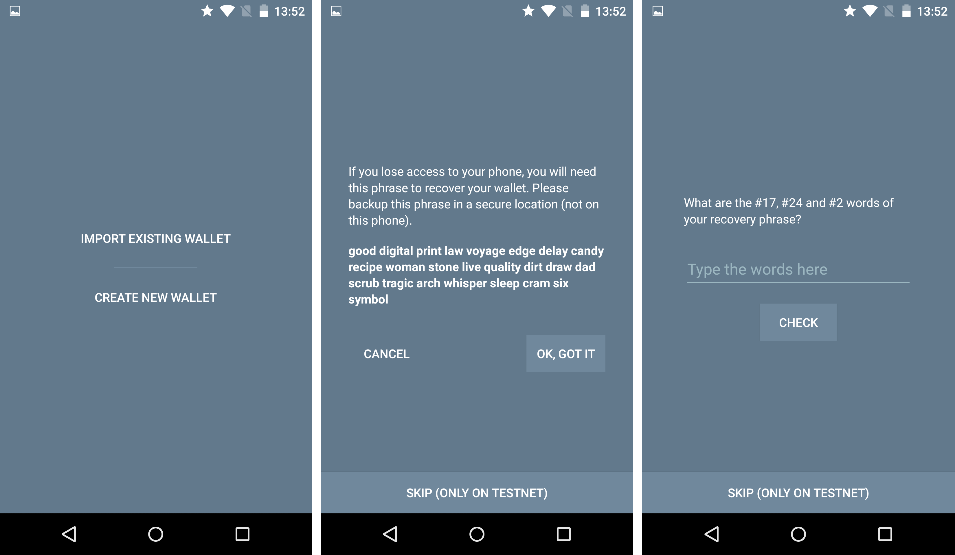
It violates some aspects of what was described in the setup flow in Objective 2, such as the proper spacing, alignment and numeric cues for the mnemonic code. However, since the focus of the analysis is the Lightning activity and the team might have the improvement of this page on their roadmap, we’ll take the option of skipping the backup altogether (that will only be the case because it’s a testnet wallet).
A first important distinction of Eclair is that it takes advantage of the first moment the user arrives in the app to give a very short but very useful tour through the wallet. That doesn’t take away the importance of an intuitive and clear interface, but it does make the user more comfortable with this first contact. It’s important to notice that the positive impact of the tour would rapidly be lost and turned into annoyance and over-informing if the explanation was too long — whether it was occasioned by long explanation texts or by too many points being explained —, which is not the case with Eclair.
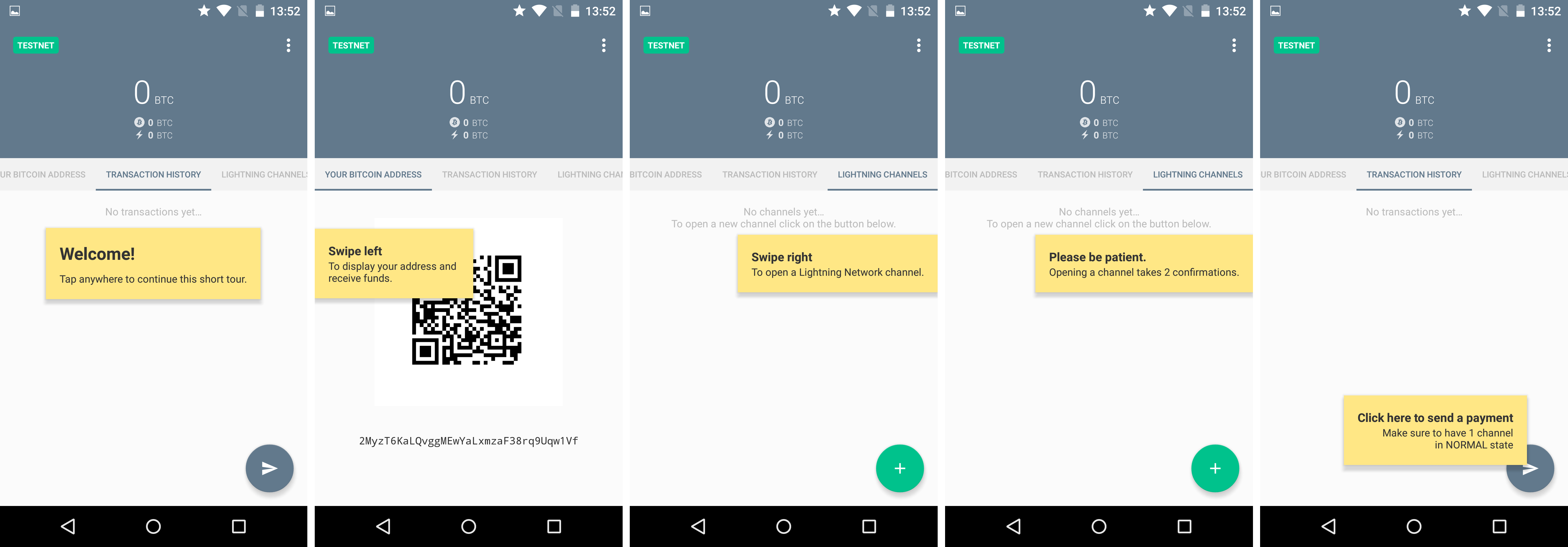
So, now that we need to fund the wallet before beginning the payment task, as it was the case with Zap, we already know where to look.
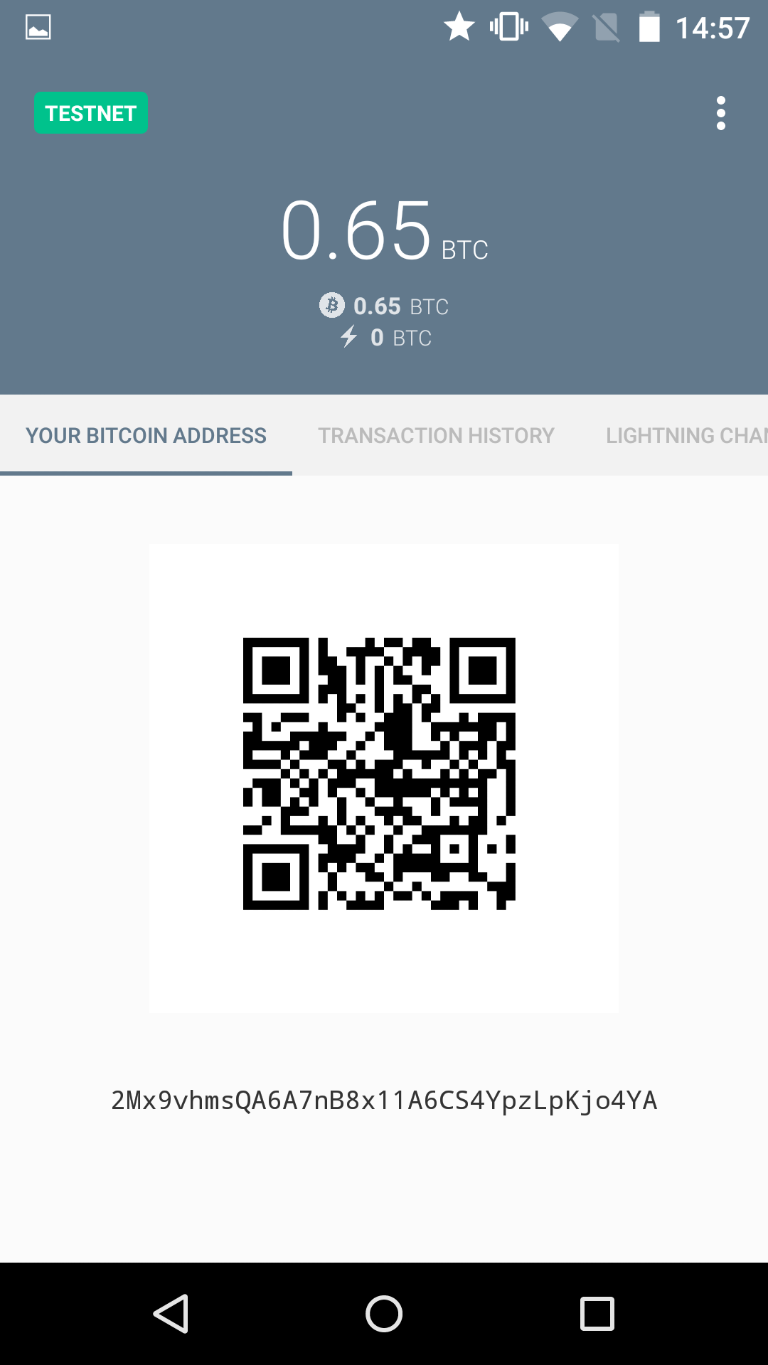
After funding, we’ll make a similar purchase as it was done with the other wallets, using Starblocks. We have an idea of where to go for the payment because of the tour but, by now, the user could have already forgotten the instructions, and he could even have waited days from the moment he started the wallet to his first Lightning transaction. That’s why a clear interface should always be the priority.
In this case, although it looks very good aesthetically, the button for sending a transaction doesn’t draw enough attention to itself. It does follow a common pattern in mobile apps that put a small circular button on the bottom right corner of the page, and the chosen icon does convey the “send” message. But, if the choice of not having a clear “PAY” button available is to be maintained, this circular button should, at least, be in a different and more bright color.
This also raises the question of where will the button for a Lightning network request be in the future. As they properly explain in their post, the Eclair team justifies that the request of Lightning payments is disabled for the moment so that it doesn’t appear as a broken feature until the proper backend structure is ready. But this will be available sometime in the future, which might lead to a questioning of the current “SEND” button. If the same button is to be used for payment and requests, the paper airplane icon used will be inappropriate, as it doesn’t convey the message of “requesting”, and should be replaced with something more generic for financial transactions. If it isn’t placed in the same button, it will either mean that another button will be displayed on the transactions page or that this functionality will be moved to a different page. In the first case, the pattern of the circular button will make less sense, as it is normally used as one button only. In the second case, it will probably result in the “Your Bitcoin Address” section being transformed into a generic “payment request” section. No matter what choice is made, it will probably result in a revision of this “SEND” button.
Using it as it is now, the “SEND” button gives the choice of both pasting or scanning a payment request. The pasting only works if the code was previously copied by the device, which is not obvious and might lead to a mistake in the first time the user performs the operation.
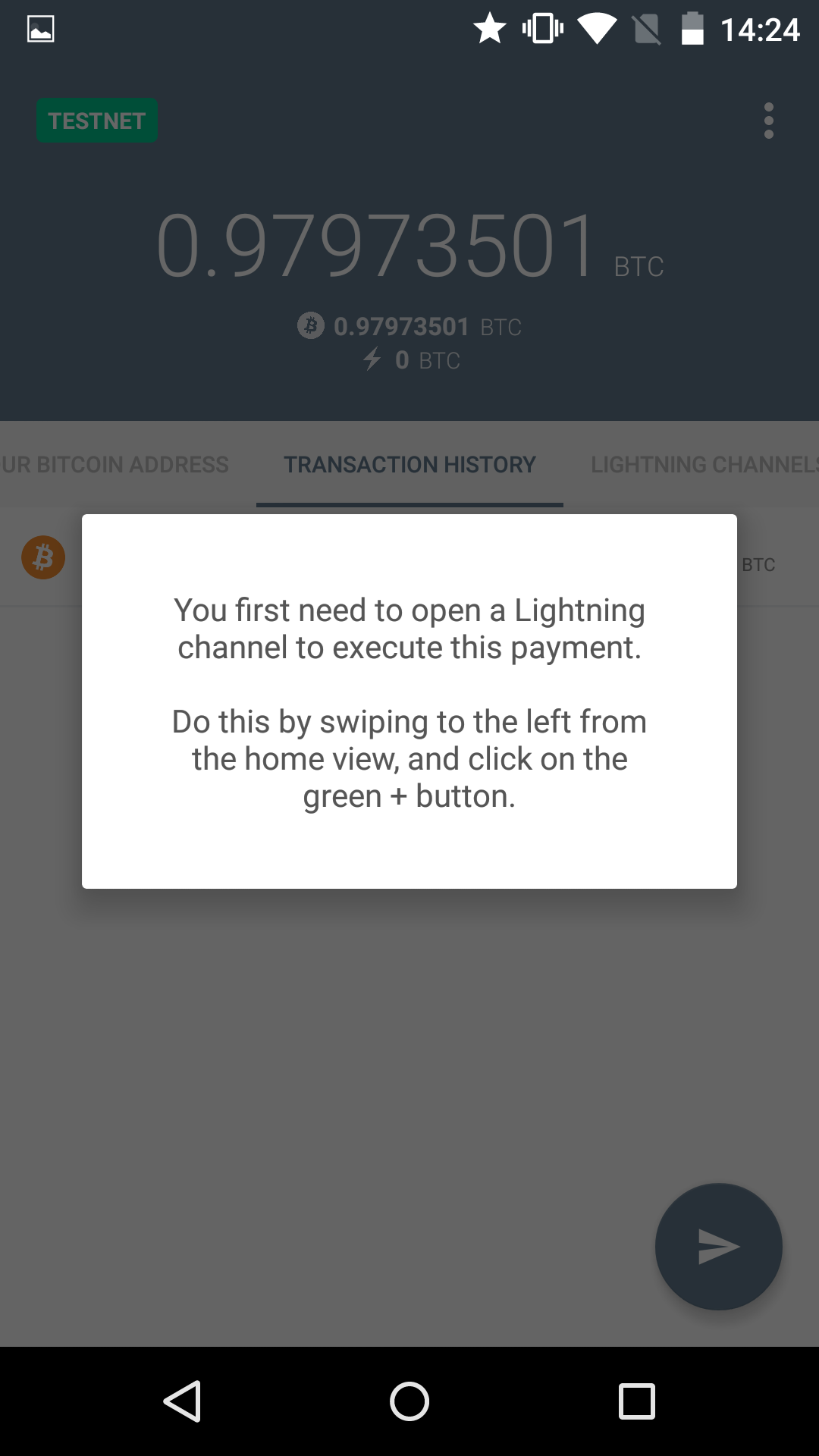
As the payment request is scanned, a message tells the user that he needs to manually open a Lightning channel before being able to pay and it also indicates where to perform such an operation. The break of the user experience due to the manual channel opening requirement was there, but it was much more smooth than the stress caused by the display of a system error with ambiguous messages in a red background.
In the Lightning channels page, we see a small instruction taking advantage of the empty space, as it was suggested previously for the Zap wallet. Also, the “NEW” button already calls more attention to itself due to its bright green color, as suggested above for the “SEND” button.
The three options provided for opening a new channel are pasting or scanning a node URI and auto-connecting. It would be nice, in the future, to have a way to a search for peers, similar to what Zap is implementing.
The auto-connect option is, from what can be understood in the blog post, a kind of pre-implementation of an auto-management of channels. Only it’s not really clear if the auto-management will take place automatically or if the user will need to deliberately ask for it in this option. For now, it’s a hacked self-bootstrapping for the wallet that might as well serve its function, even with the underlying structure still under construction. That’s the option we will choose now.
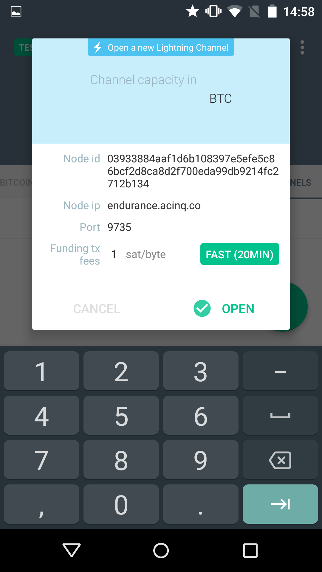
It opens a window with a hard-coded choice of the node and it only requires the user to fill in the amount to be committed to the channel. The technical information displayed (node id, node IP, and port) is not very user-friendly but it’s necessary for a manual channel opening. This degradation of the experience will only be avoided when users don’t need to go to that option very often.
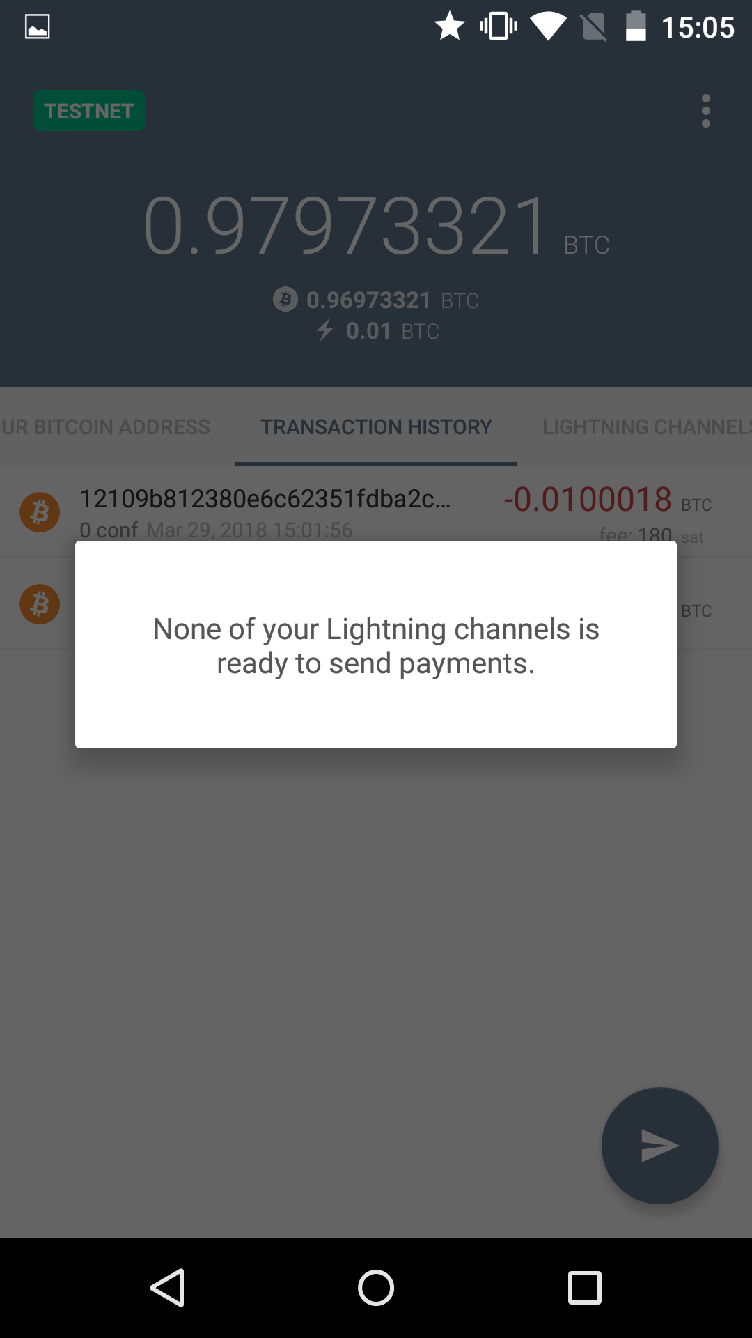
If the user decides to go for the payment now that he’s asked to open a channel, but before his transaction was confirmed, he will receive a different message saying that his channels are not ready for payment. That’s an important detail as, if the message was the same from the last time, it would seem like a bug/delay or the user simply wouldn’t understand why he couldn’t send the payment, both possibilities having the consequence of arousing more confusion.
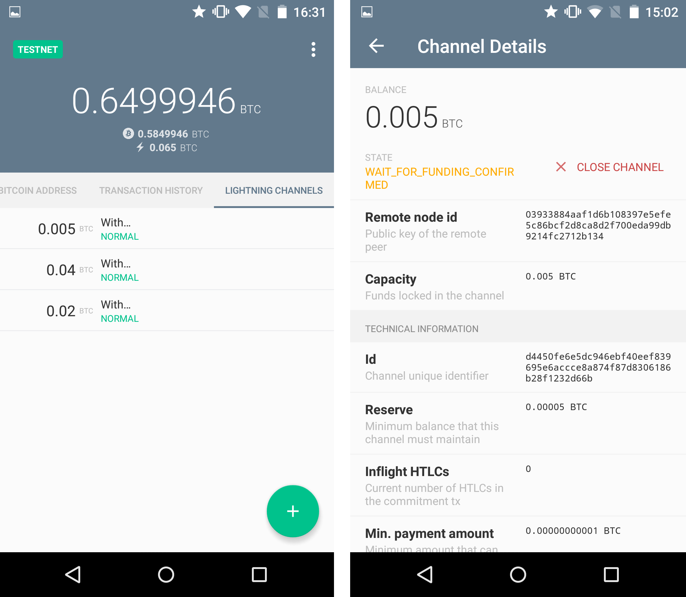
With some channels already open, we can observe that the general layout and color coding of the displayed channels is very good. There’s also the possibility of seeing a complete channel information page if the channel row is clicked upon. Just the “With…” label is confusing and unclear about the message to be conveyed, but it might only be an issue from the development phase.
After having at least one channel confirmed and in the “normal” state, the payment can finally be carried out.
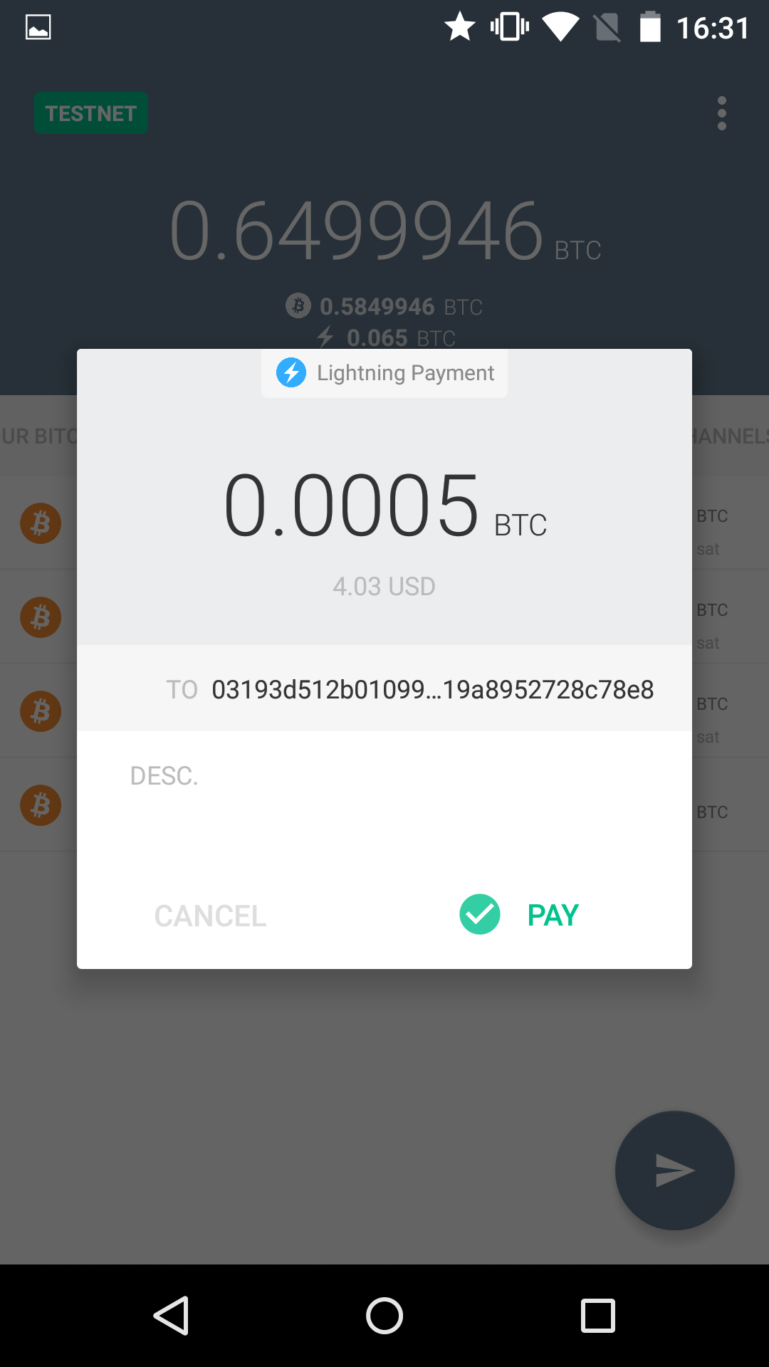
The window that automatically opens when the payment code is scanned shows the amount to be paid, the conversion of the amount to fiat currency in a subtle display, a “To” field, a description (if one has been given by the requester) and the identification that it’s a lightning transaction. After confirming that the information is correct, the user can hit “PAY”.
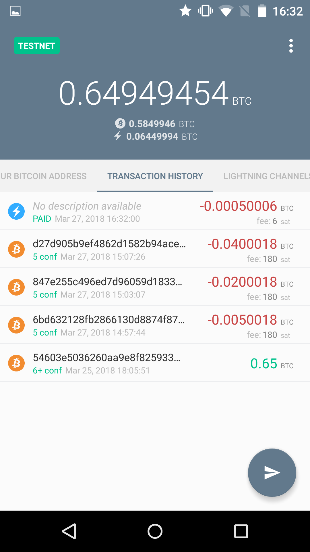
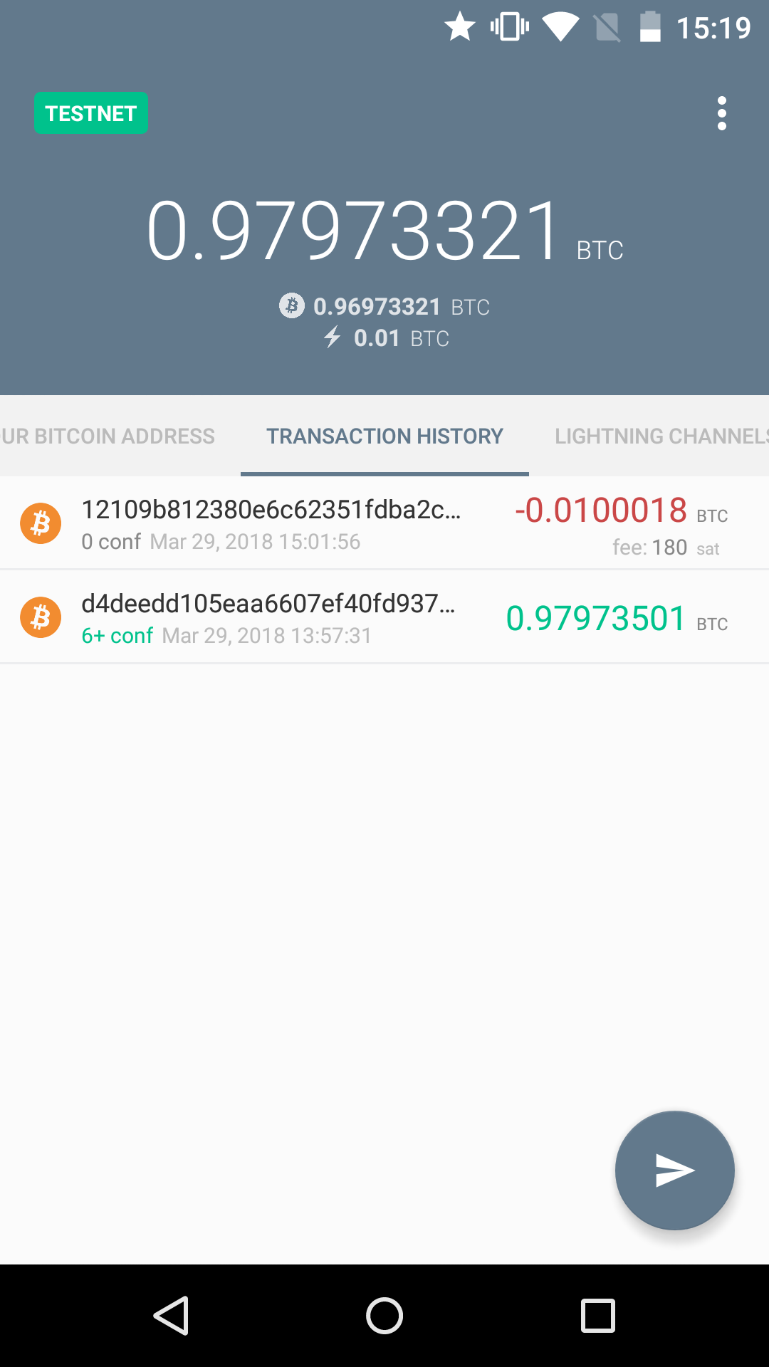
Since it’s a lightning transaction, it will appear almost instantly as “paid” in the transactions list. The transaction data displayed in the transactions section is very rich for such a small available space, and it does that without getting too cluttered.
There’s a clear indication through the use of badges of whether the transaction was a lightning or blockchain type. A small suggestion here would be to change the Bitcoin badge for a “chain” badge (similar to Zap) since they are all Bitcoin transactions from the user’s point of view.
The complete timestamp of the transaction is shown, as well as the number of confirmations for blockchain transactions. This is particularly important as Eclair’s objective is to be a general purpose wallet, so easily keeping track of confirmations will be a daily need.
The description field is only available for Lightning transactions. It would be a good future improvement to implement the possibility of putting labels in blockchain transactions, as well, to facilitate accounting. This label would replace the Transaction Id shown at the moment, and this Id could be available only on the transaction details page that can be viewed by clicking on the transaction row.
As for the right part of the page, it shows the amount transacted with a color signifier of a transaction that was sent or received. Besides, it puts a negative signal before amounts that were paid by the user. It also appends the fee paid for each transaction in a smaller and lighter print that doesn’t compete so much with the main information, which is the amount.
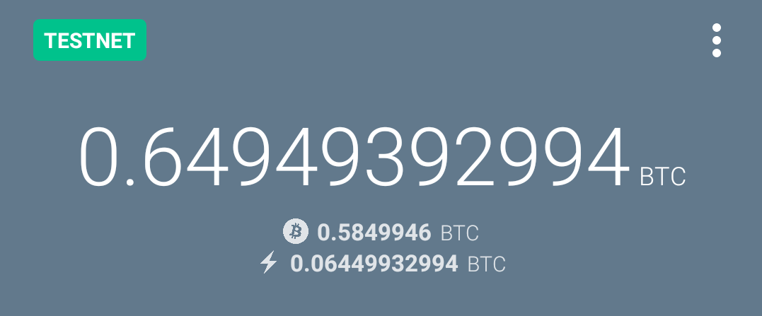
Although it wasn’t mentioned until now, the wallet clearly shows the total amount of funds in a high visual priority in the screen, with the amount available for blockchain transactions and the amount committed to lightning channels right below in a lower visual priority. The only element missing from the guidelines suggested in Objective 2 is the conversion to a fiat currency that should be shown at least for the total value.
As it was said before, Eclair doesn’t currently support the request of Lightning payments, making the completion of the “request” task impossible at this time. As a consequence, we will skip to some extra comments about the interface.
Eclair counts with a more modest view of the current state of the network, but it’s more than enough for a regular user. It’s further aligned with the suggestion this study made earlier when analyzing the Zap interface because it keeps this network section in a hidden menu, so it doesn’t compete for attention with more important elements. Also, it presents information about both the blockchain and the Lightning network, which makes sense with the intention of being a general purpose wallet.
The approach that the Eclair’s team seem to be taking is to make things work with few features to later increment them, so it looks like a very promising development. For the future phases, this study will leave the suggestion of increasing user freedom and control over some actions, for instance: allowing typing in input fields, adding custom label options and allowing to create payments with a pre-defined requested amount (both for the blockchain and the Lightning Network).
Conclusions
After conducting the research in its entirety, a straightforward answer can be given, using the knowledge and data collected along the way, for each of the objectives defined at the beginning of this document.
1. Identify the current state of development of the Lightning Network in relation to how ready it is for regular use (i.e. not only specialized testing) on the mainnet.
The current state is considered to be not ready for use unless the user’s purpose is to test and aid the network development. Even in that case, the only apt user, at the moment, is a technical expert user who can perform all the necessary operations without the help of a graphic user interface. That’s not a failure of any type by the developers of the Lightning Network, it’s just a part of a healthy development timeline conducted by serious professionals. It would be irresponsible to consider it completely ready at the moment.
Nevertheless, the evolution is going on full-steam and the situation might change in a few months. Even during the period of this study, the two other main implementations of the Lightning Network, lnd from Lightning Labs and Eclair from ACINQ, have become available for the mainnet in beta (lnd / Eclair). A consistent rate of development has been perceived until now and it’s expected to go on like this. It would be reckless and risky to build such a system in a rushed manner.
2. Visualize how a user interface should be built in order to accommodate the new functions of the Lightning Network and provide a good usability and experience.
The interface that was described has served its purpose of highlighting the elements and the thought process that the creative team of a wallet should have in mind. Giving visual priority to the actions that are expected to be more used, balancing the amount of information that should be displayed in order to avoid clutter, and creating constraints to improve user security are all examples of the necessary priorities that pave the way to a wallet with a good user experience. The exact structure that was proposed can be used as inspiration for other projects, as well, but it’s not necessary to do so if the underlying concept is being preserved.
As it would be with any other technology, be it groundbreaking or something people are accustomed to, the design principles which should be used as guidance are the same. The ten heuristics used in this analysis, for example, can help developers think better about a product from the user perspective. Obeying the Gestalt principles for a clear and easily comprehensible layout are another important approach. And, in a more advanced stage, observing how your users react to and use your product is one of the most insightful measures to improve the UX.
3. Review usability aspects and design decisions of the current solutions of graphic user interfaces, taking into account the early stage of development they are in.
After reviewing all three wallets, the general impression is of a relatively good consideration of users needs, possibly learned from the improvement of regular Bitcoin wallets through the years.
None of them is ready for use, as it would be expected, since not even the underlying structure (the Lightning Network implementations) are. Nevertheless, both HTLC.me and Eclair are more usable during this test phase than Zap. It might be a matter of what is being prioritized in the development process, since Zap is the one with the most apparent features and complexities. While, in practice, it becomes difficult to complete any task in Zap without running into many errors (some of them unexplained). Maybe an approach similar to Eclair’s, which is slowly adding functionalities but making the ones that are already there work better, would result in a more productive feedback cycle from the people who are trying out the wallet to help the development team.
Apart from that, all three wallets have improvements to be made in their interfaces and should review some design decision, all of which were pointed out in the Objective three section. But the simple fact that, at this stage of development, there are already competitive interfaces focused on how the experience of the Lightning Network user will be is a promising indicator of the general awareness about the importance of UX for pleasant, safe and private wallets.